/ editorial design /
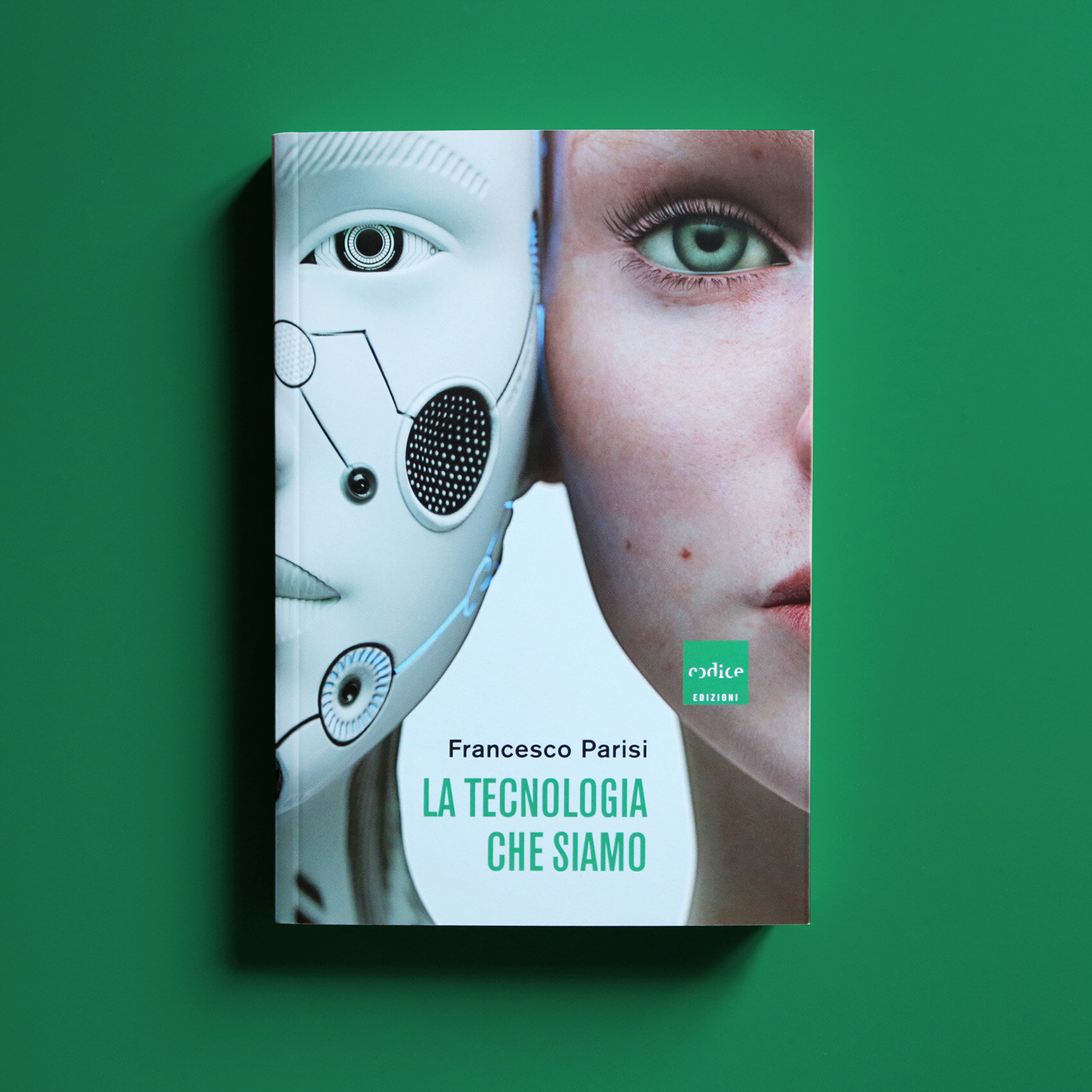
In 2019 Codice Edizioni decided to renew the graphic system of its editorial production, made of scientific and fiction titles. The redesign aim was to obtain uniformity and recognizability through a simple and flexible layout. One of the brief specifications was to make cover images as clear as possibile.
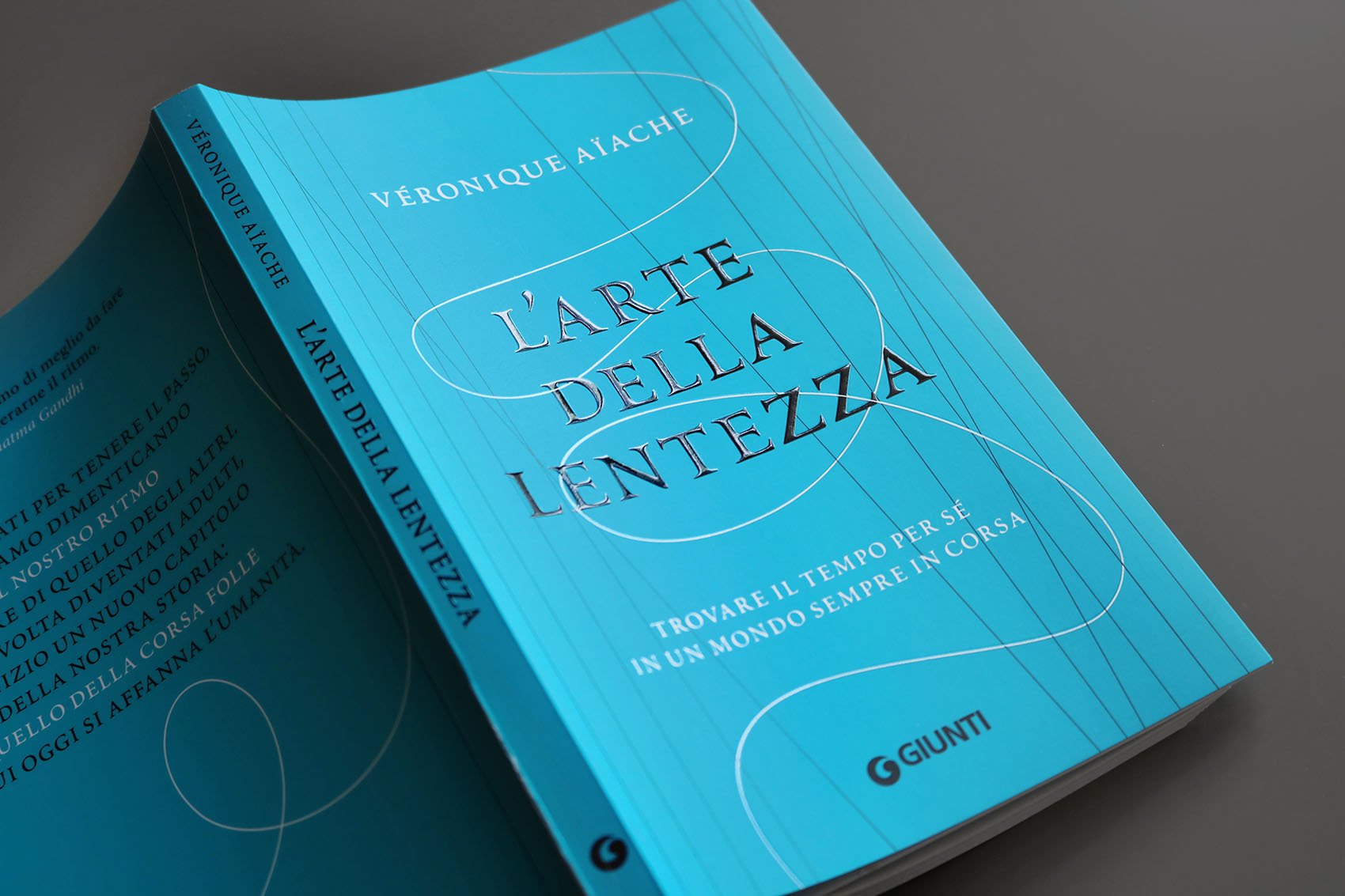
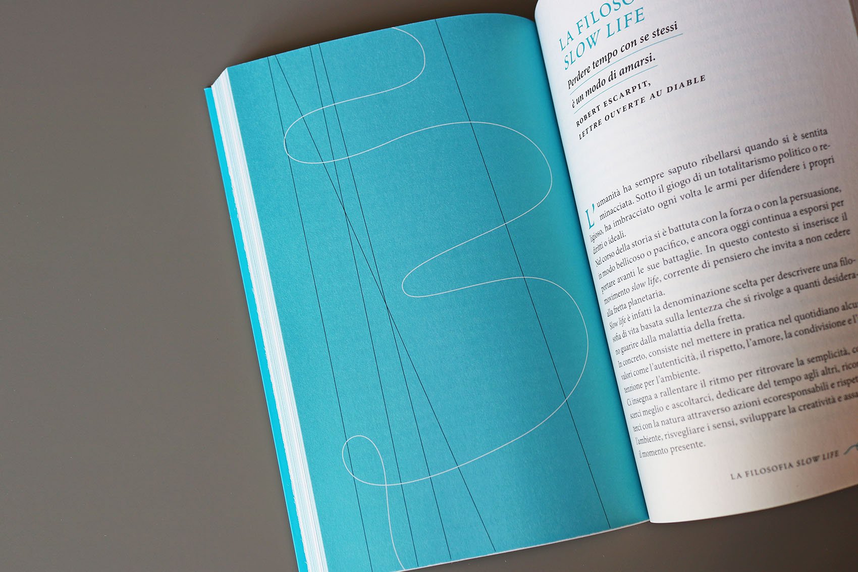
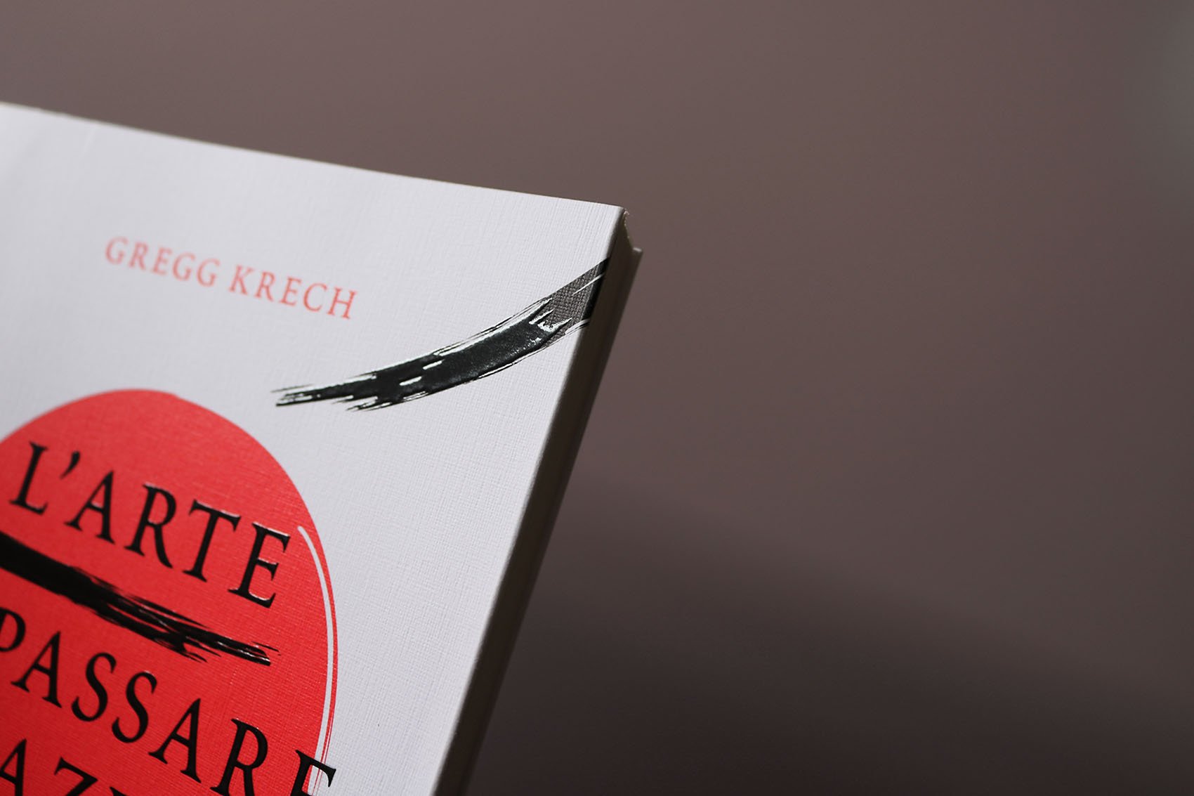
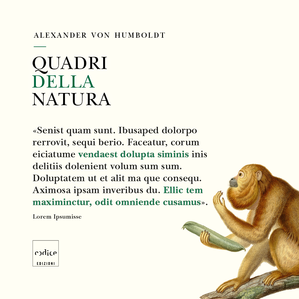
Cover layout is based on a grid that recalls the square shape of Codice’s logo, a strongly identifying element (not redesigned). There are several possible positions on the grid for logo and texts, but a diagonal alignment is constant. Images are evident thanks to the absence of frames or decorative elements that could hide them.

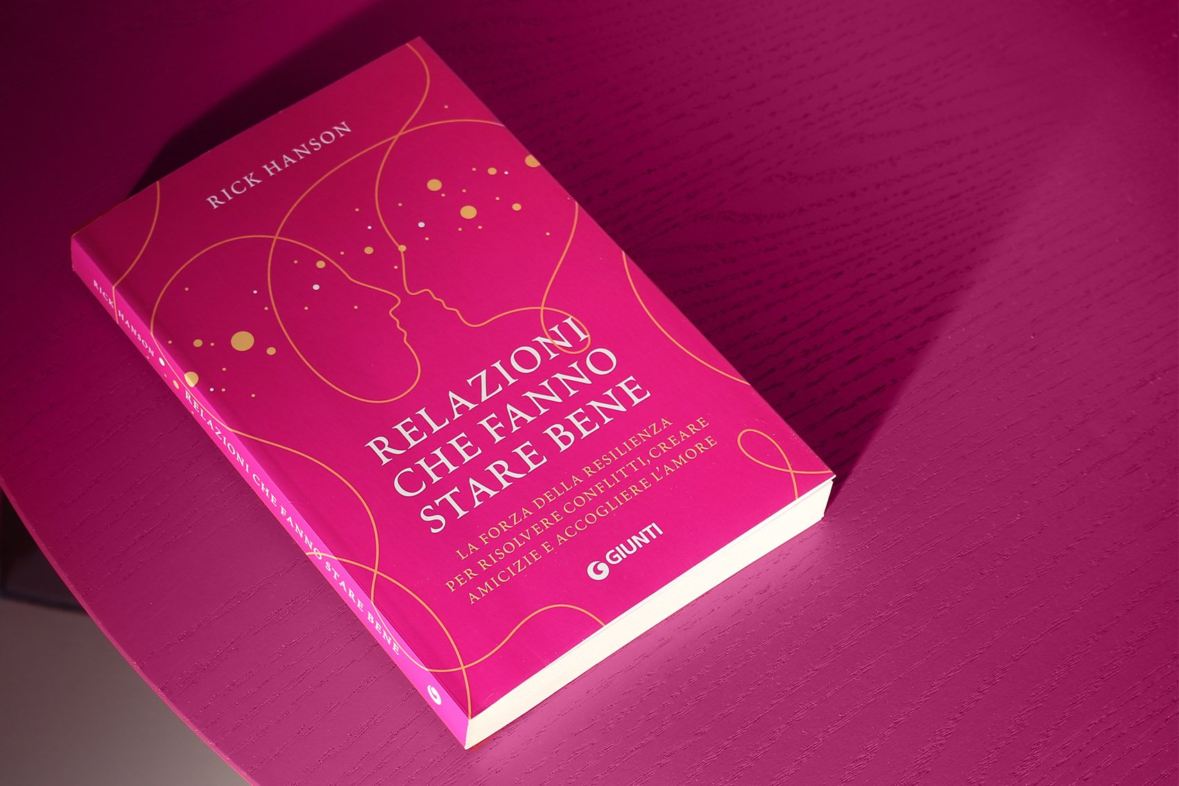
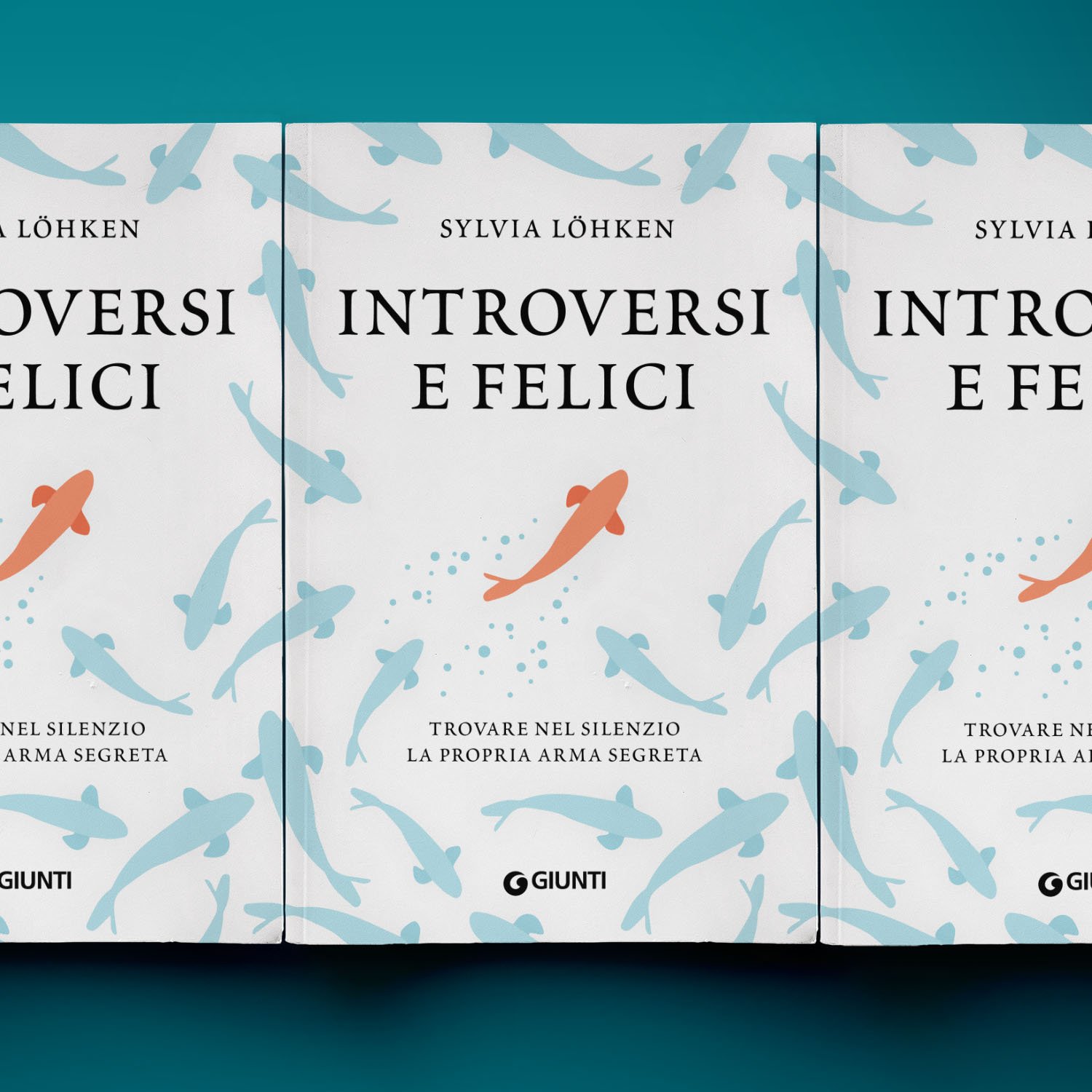
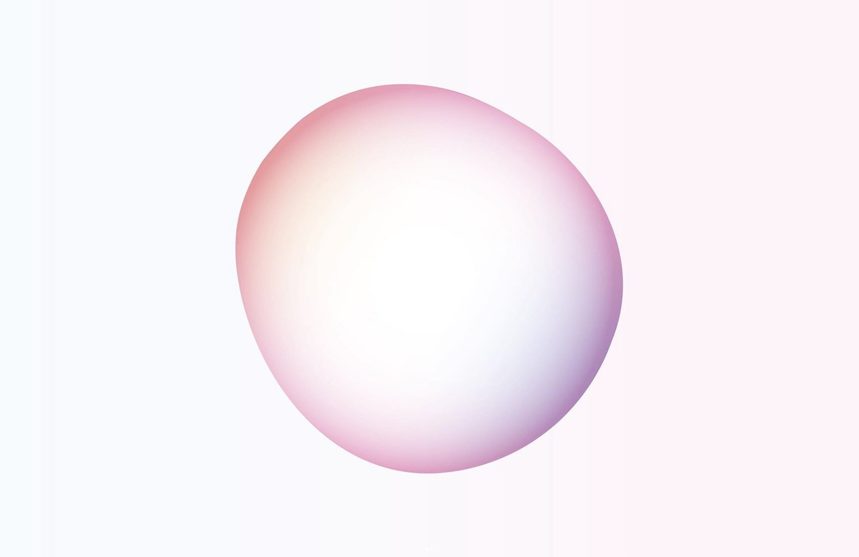
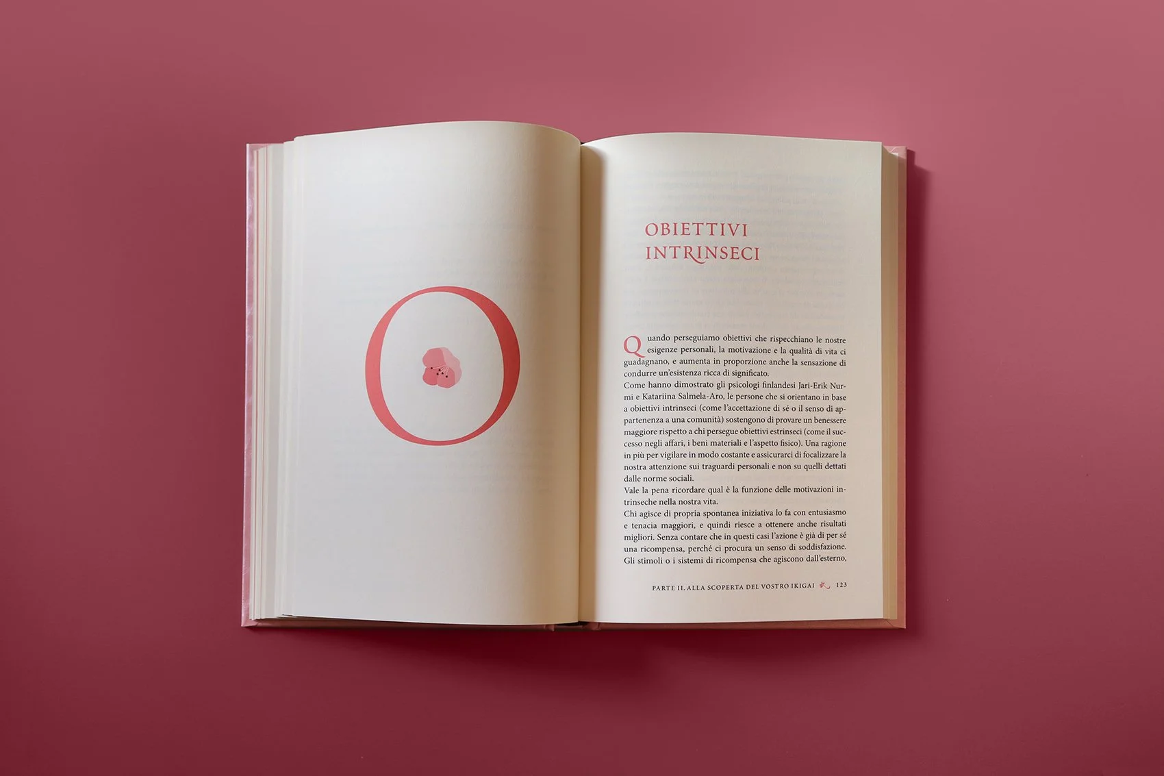
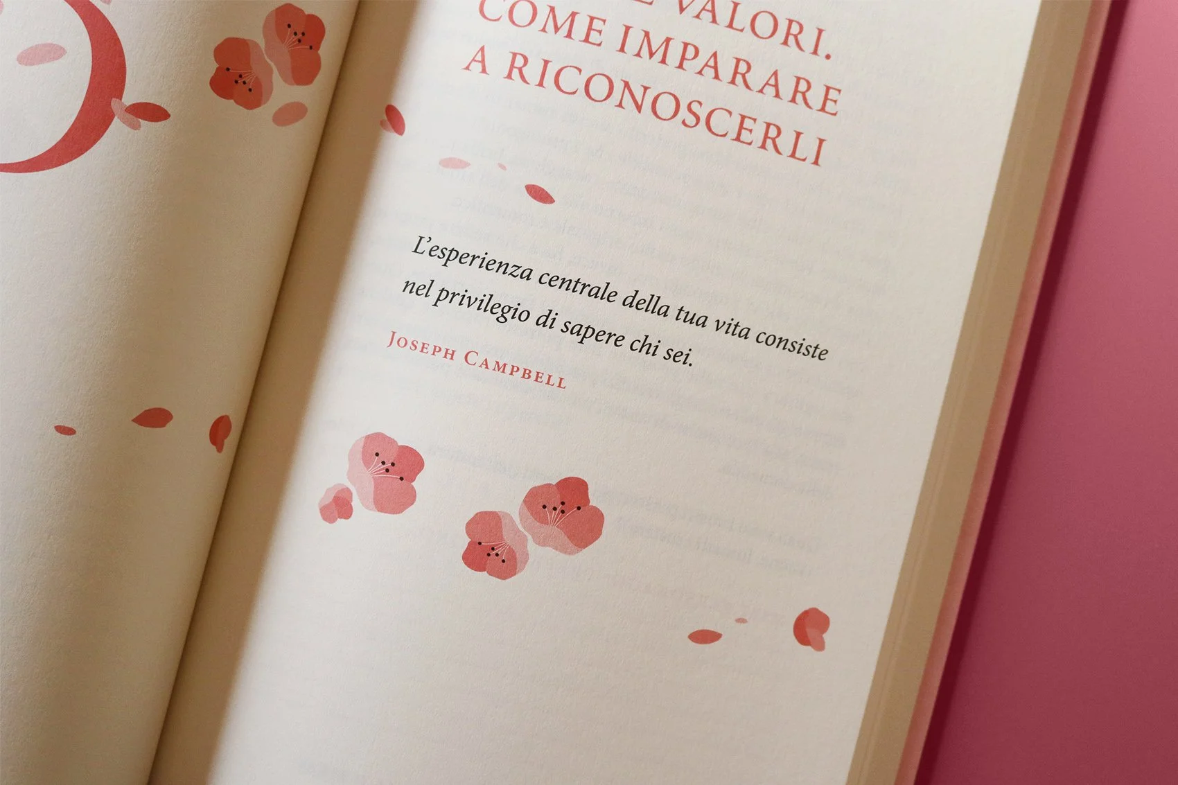
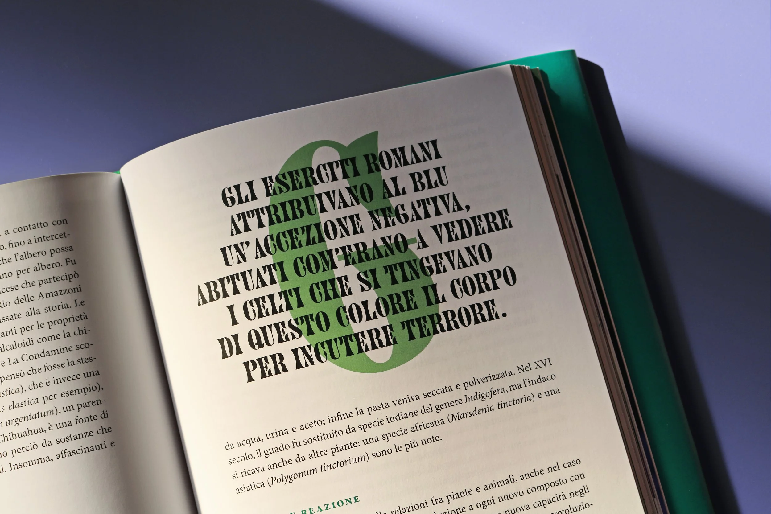
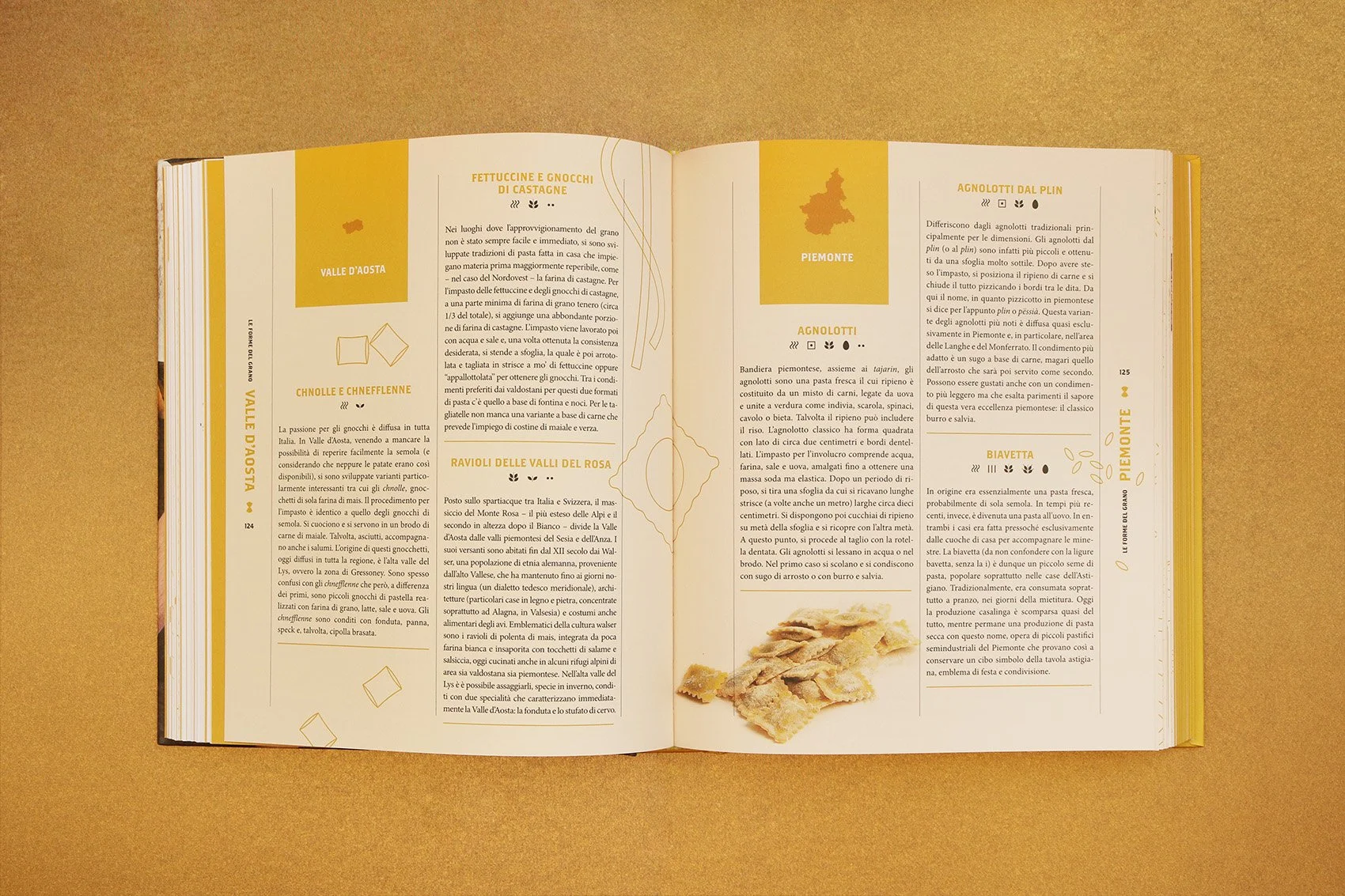
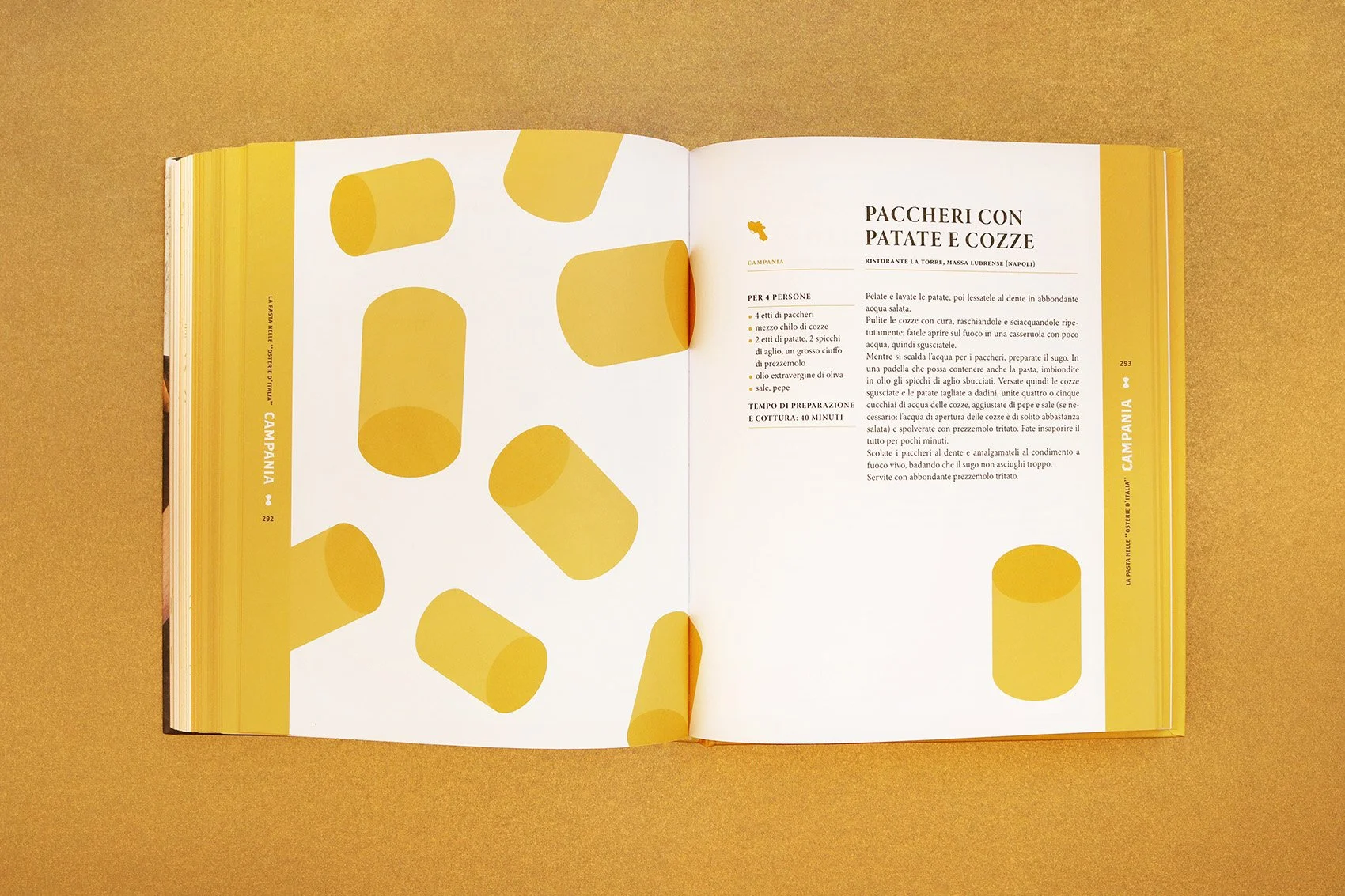
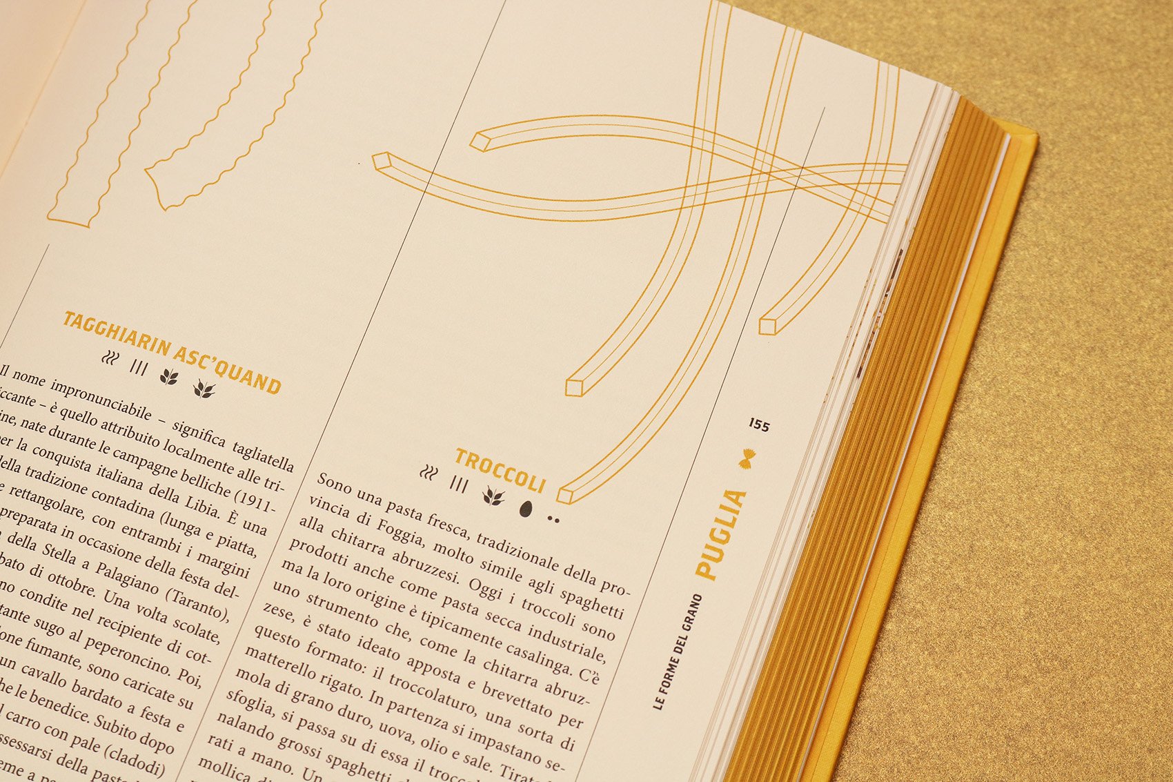
All books have in common layout and composition rules, but differ in the iconographic choices on covers: photographs, historical images and minimal graphics are used for the science titles, while illustrations, by Davide Bonazzi, appear on fiction covers. From a typographical point of view, opposite choices have been made for the two categories: a sans serif font for the scientific titles, a serif font with high contrast for fiction.
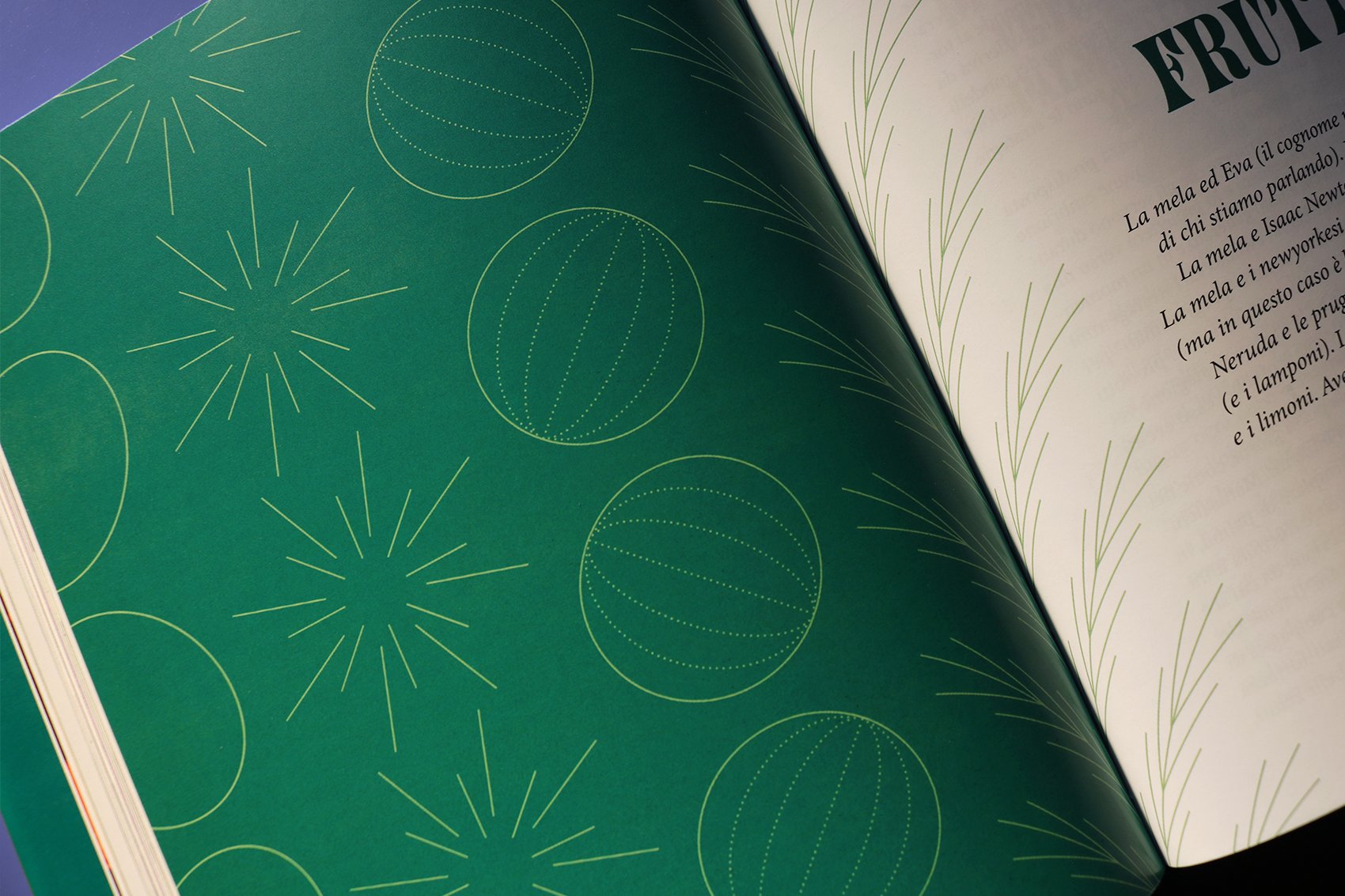
Particular attention is given to colours, as hues are vivid as possible, both in images and texts.


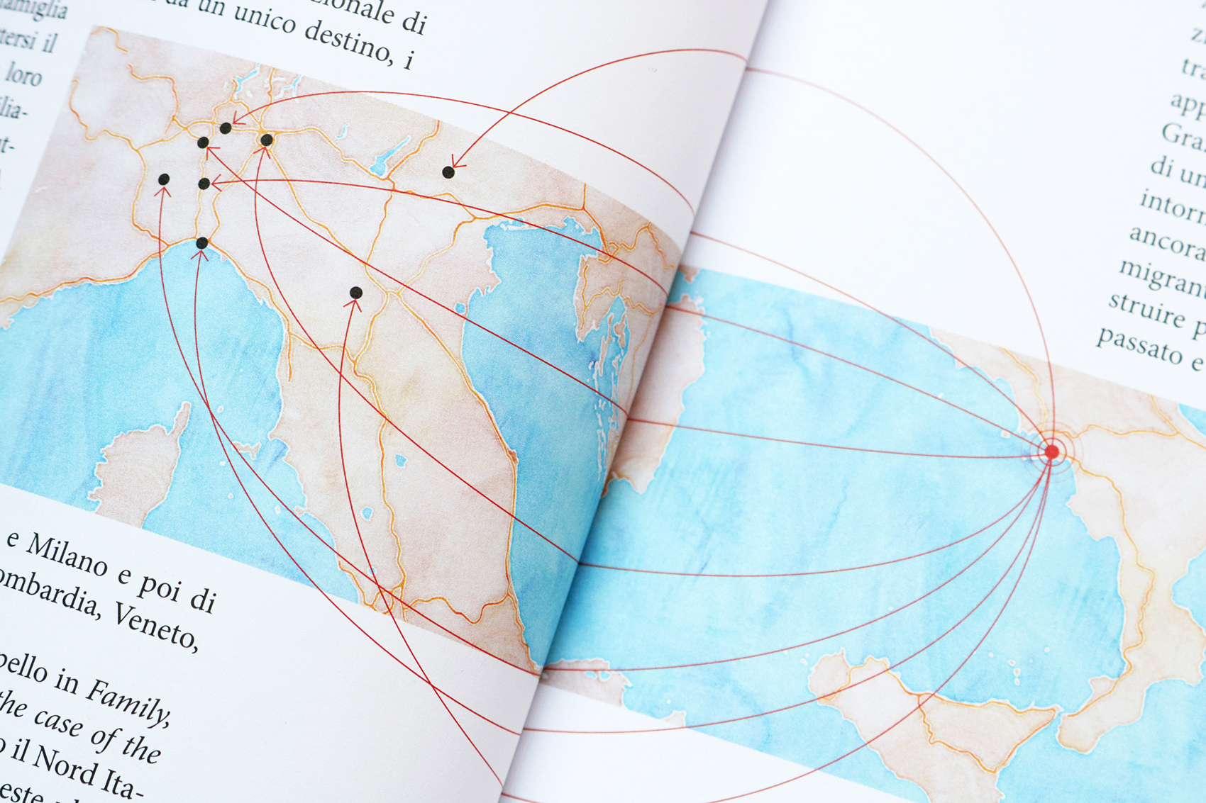
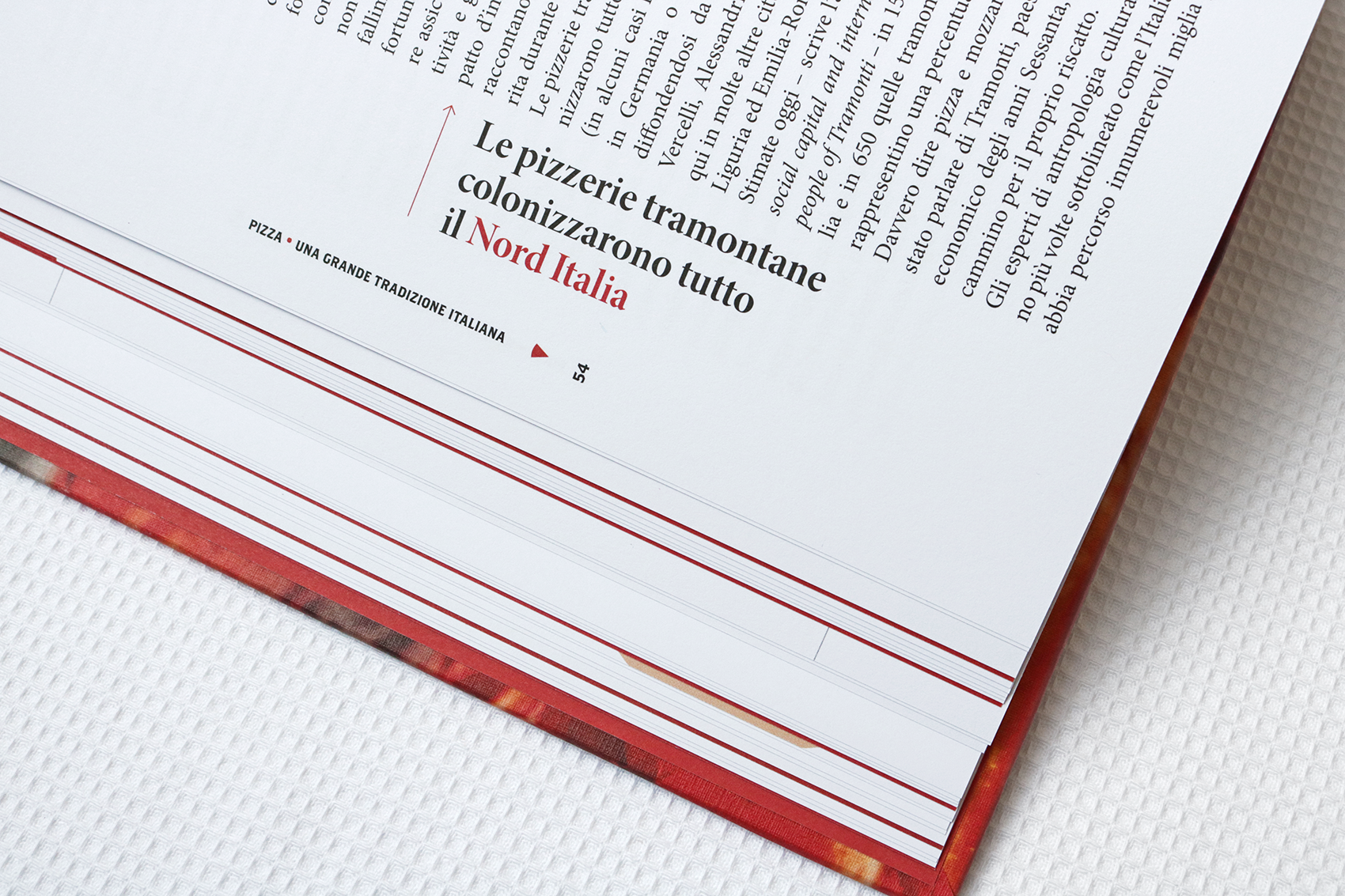
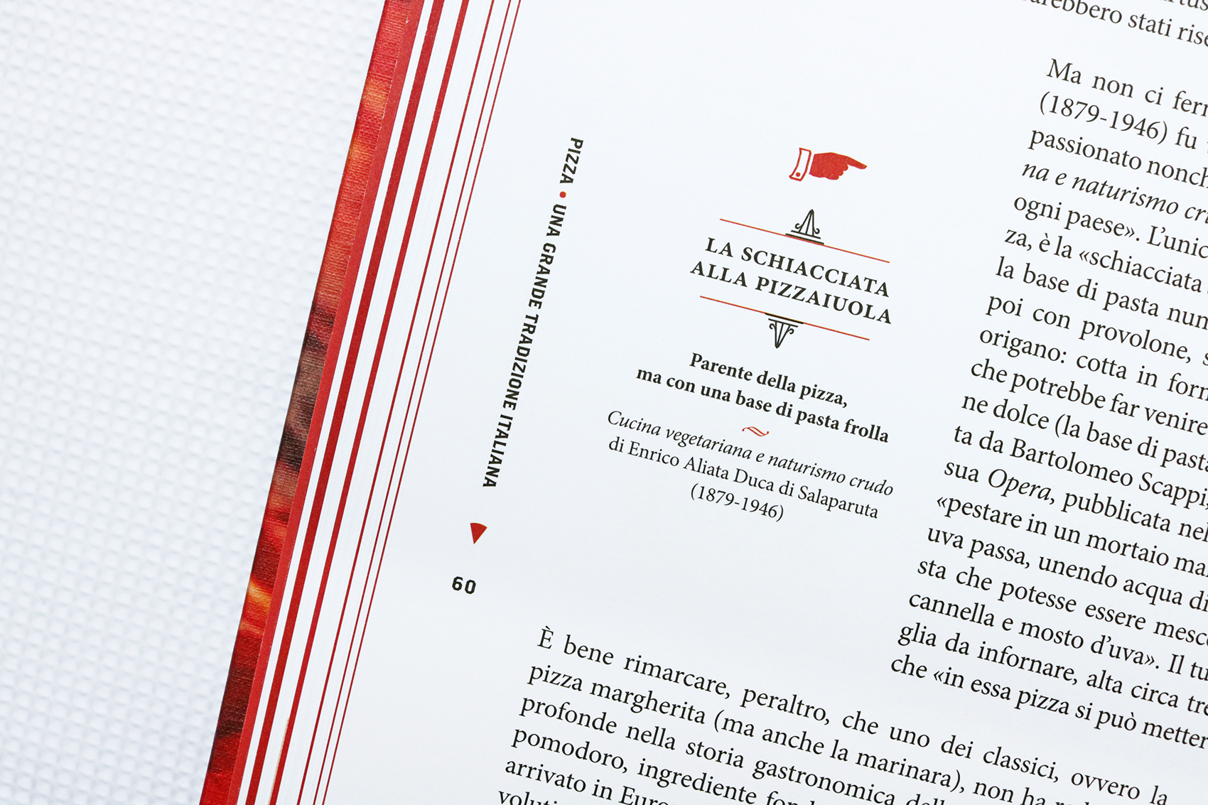
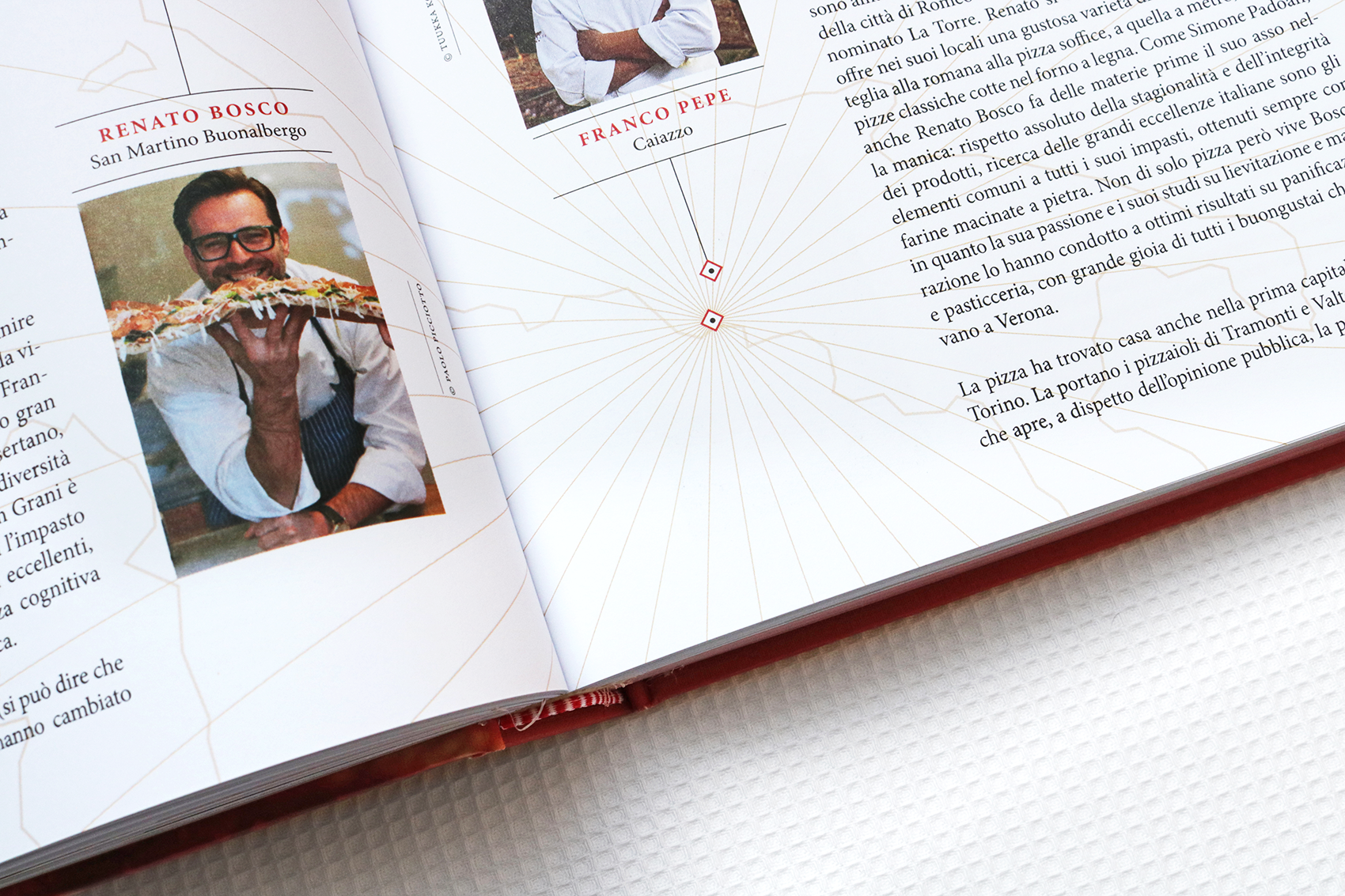
Selection of book covers designed from 2019 to 2024


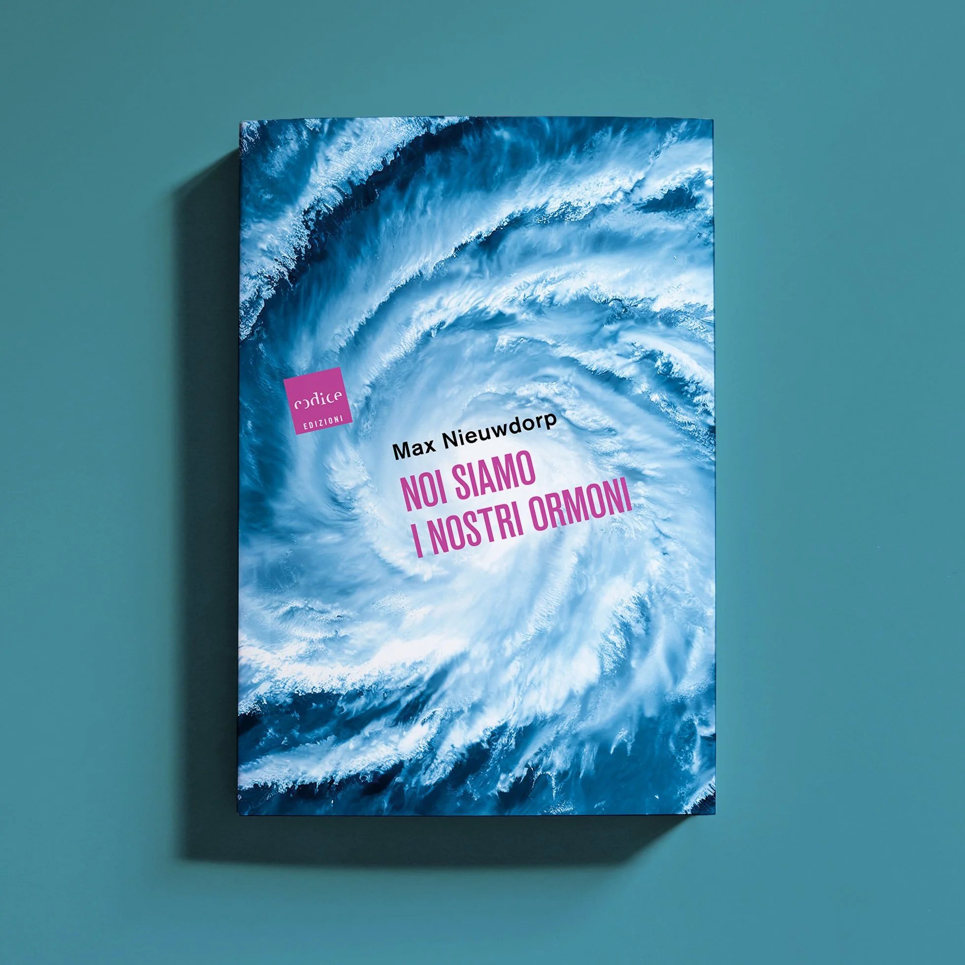


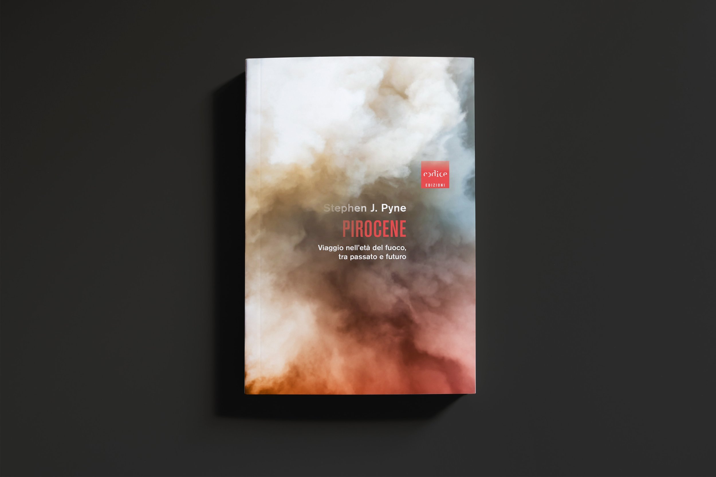


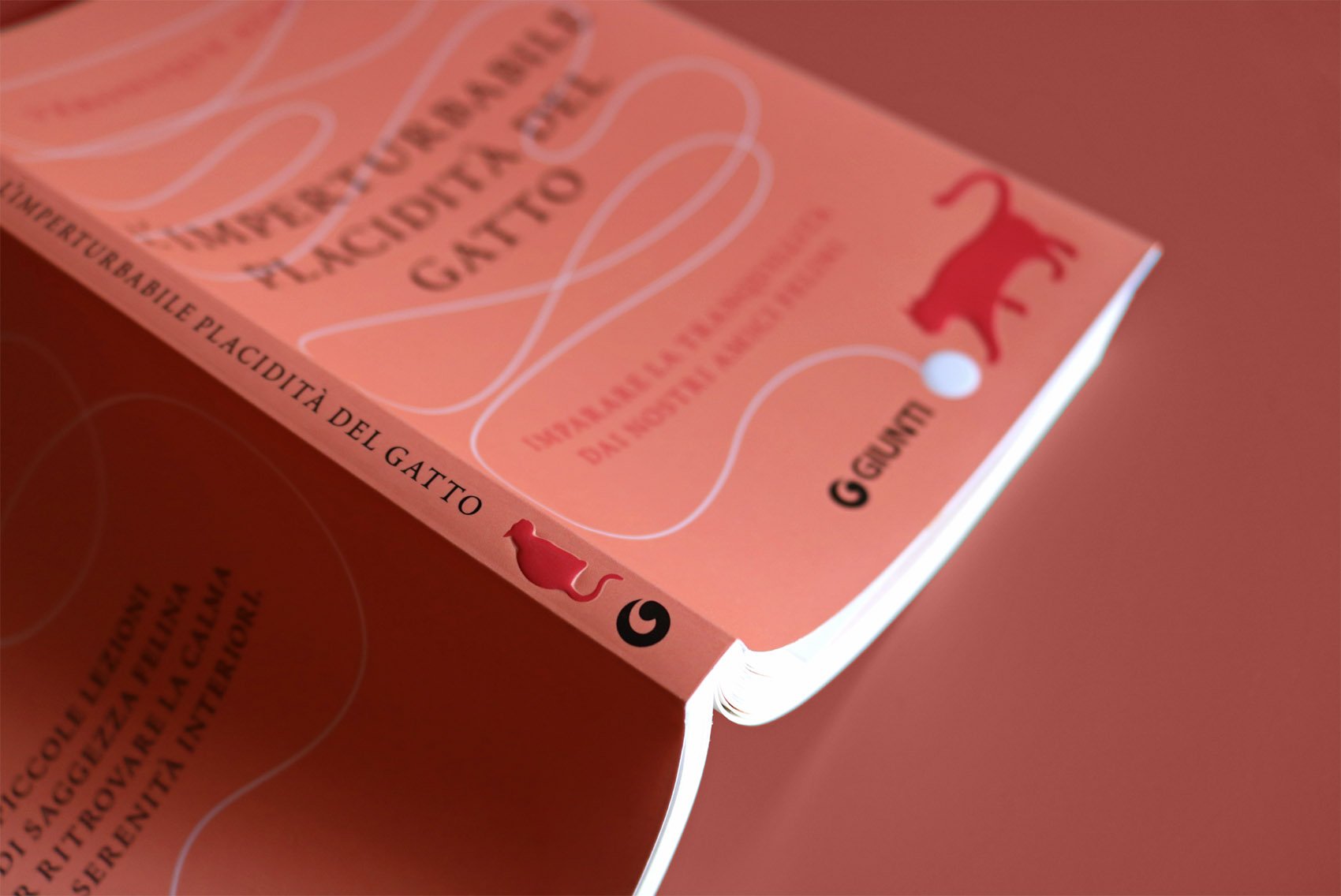
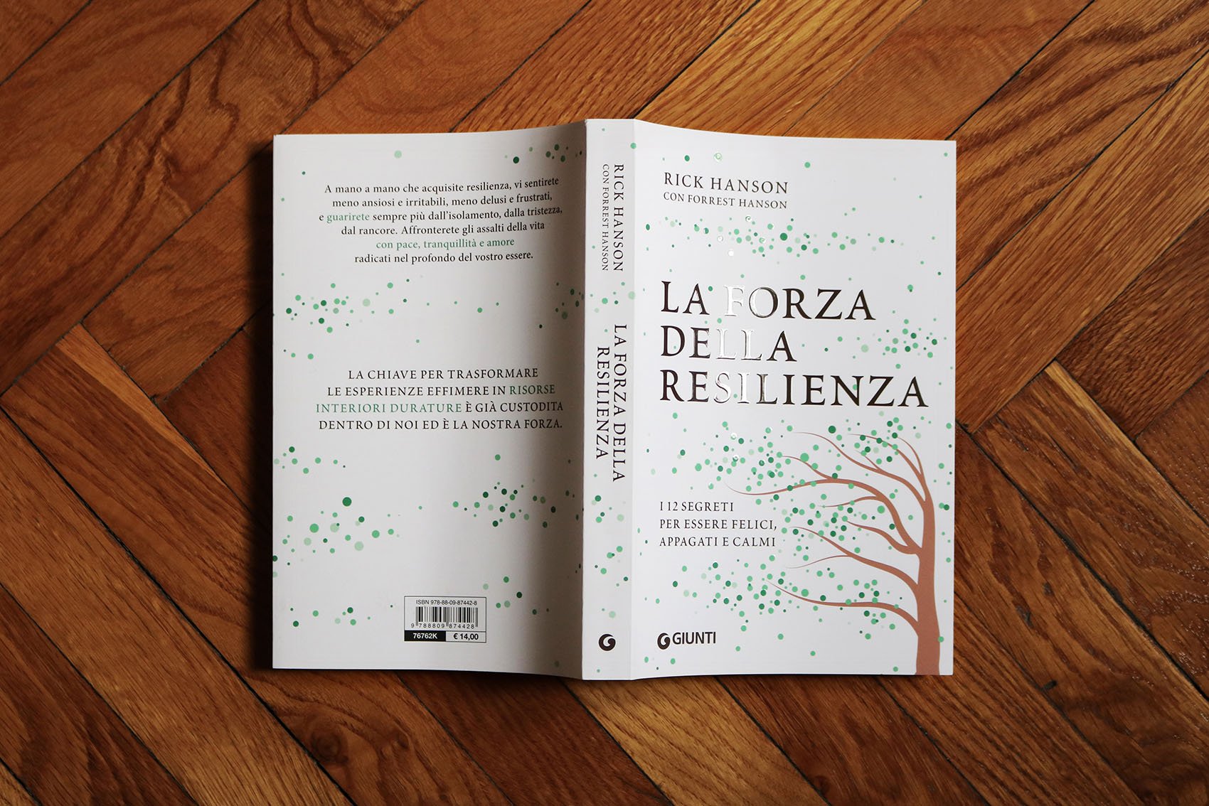
Cover visuals continue on the book spine, in order to have a colorful and variable effect. Spines are characterized by a new identity element: the "c", extrapolated from Codice logo and positioned at the bottom. The result of the redesign is cohesive and recognizable, but at the same time dynamic and mixed.


Brand collaterals

Annual catalogues

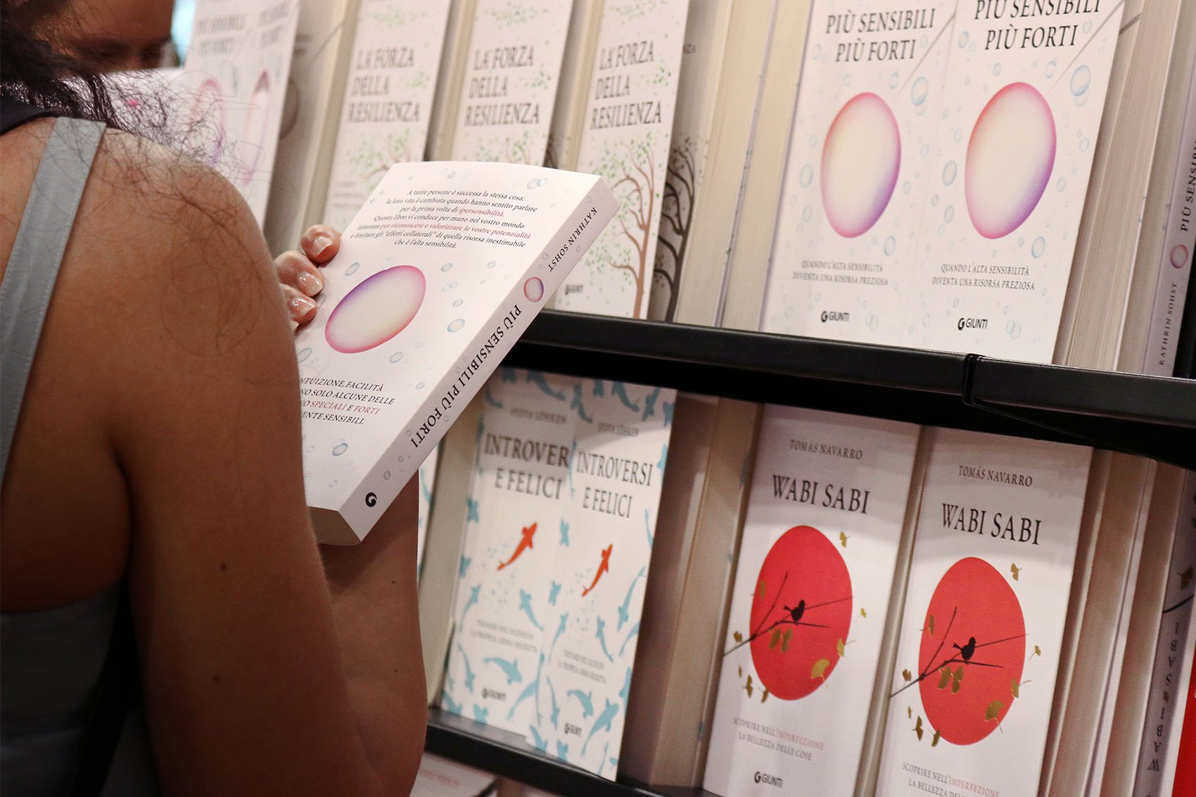
Books promotion

Promotional visual

Website