/ book cover design / book layout / illustration /
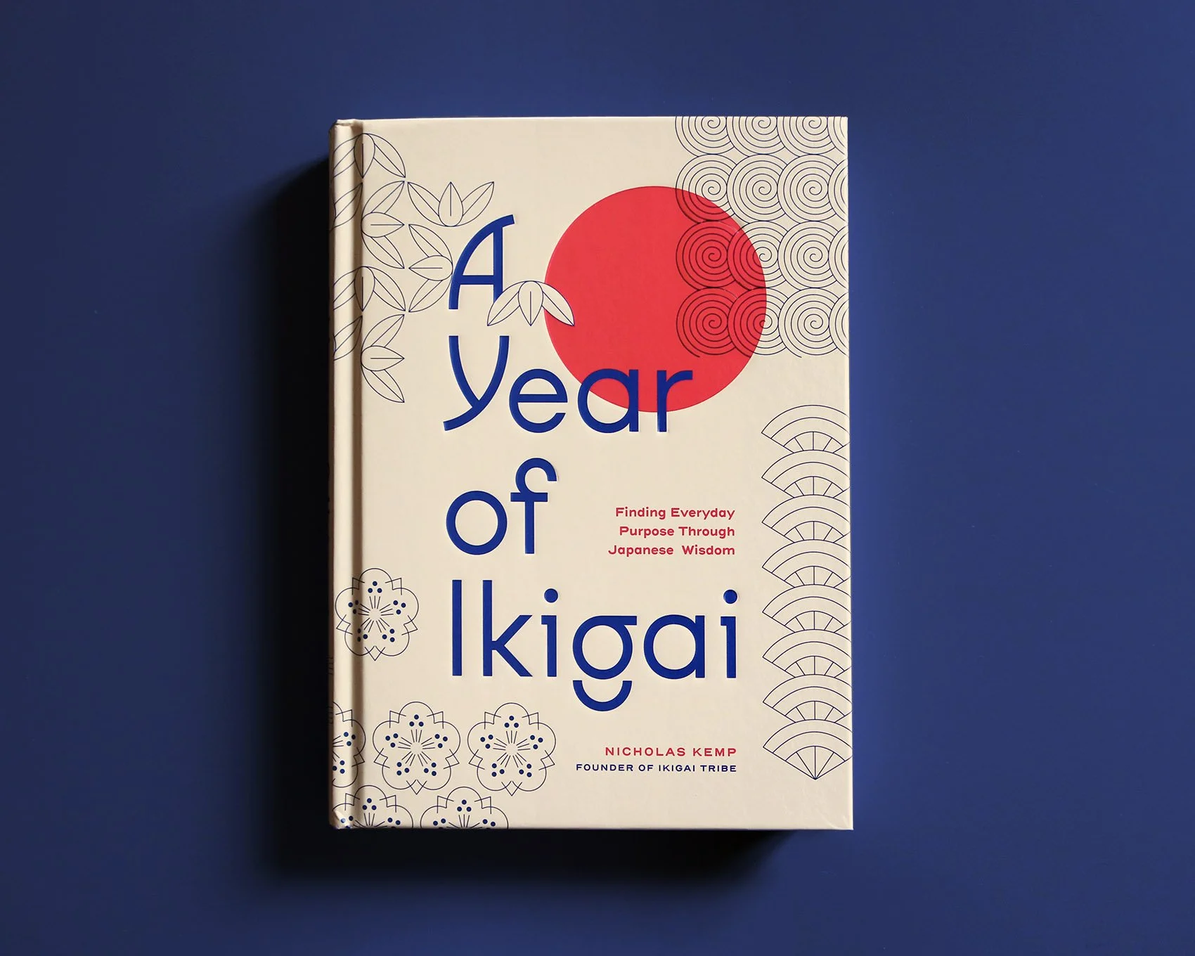
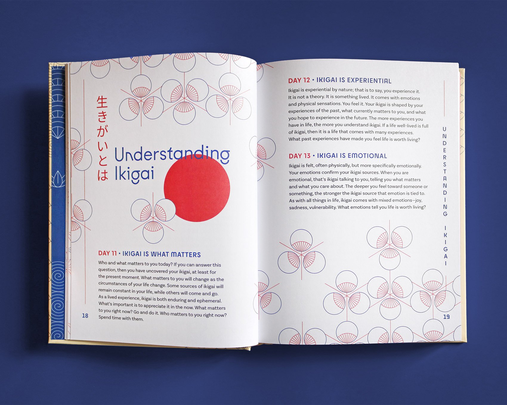
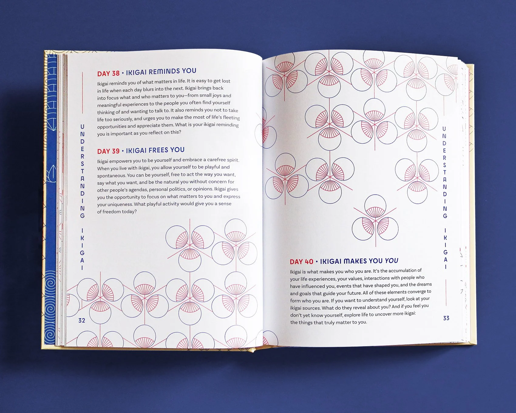
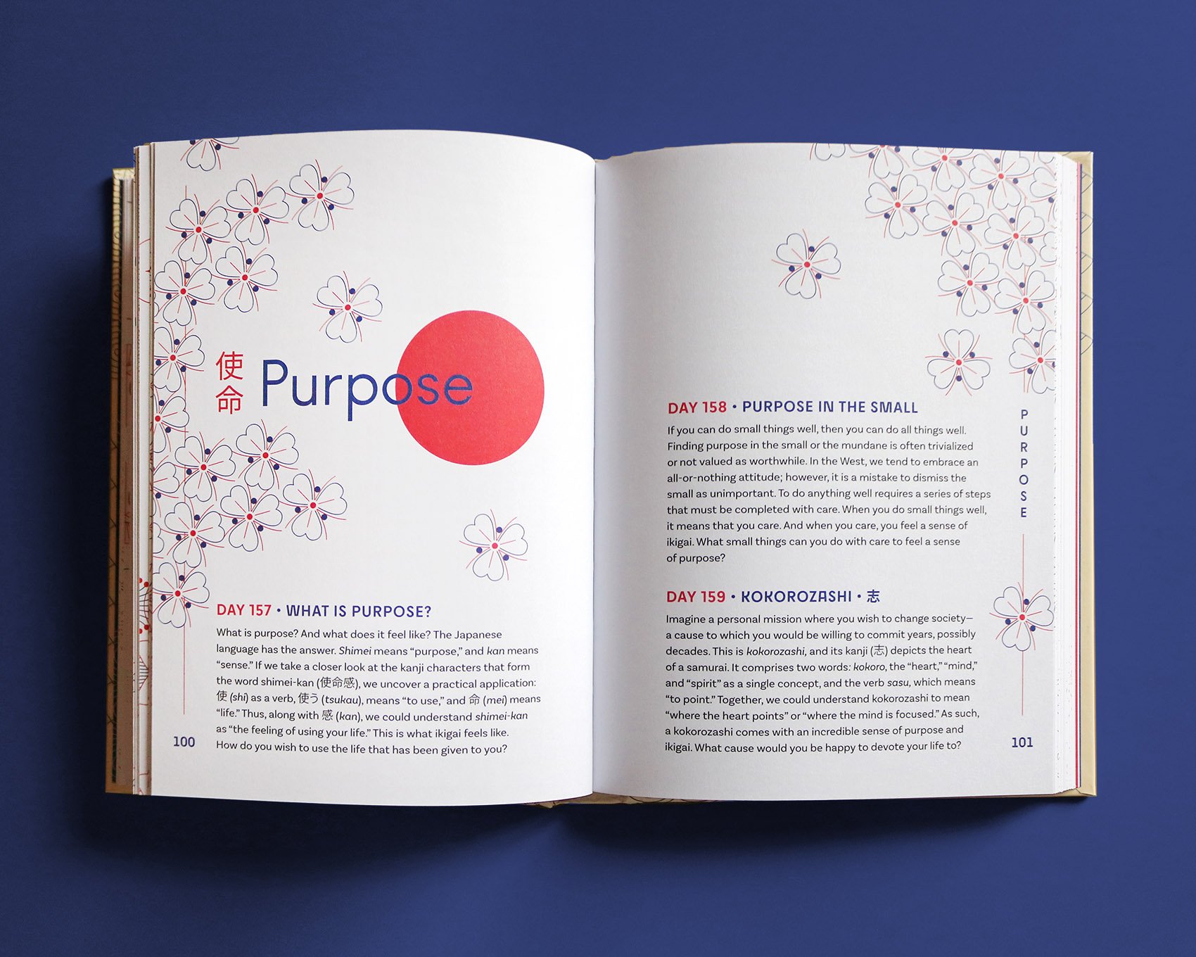
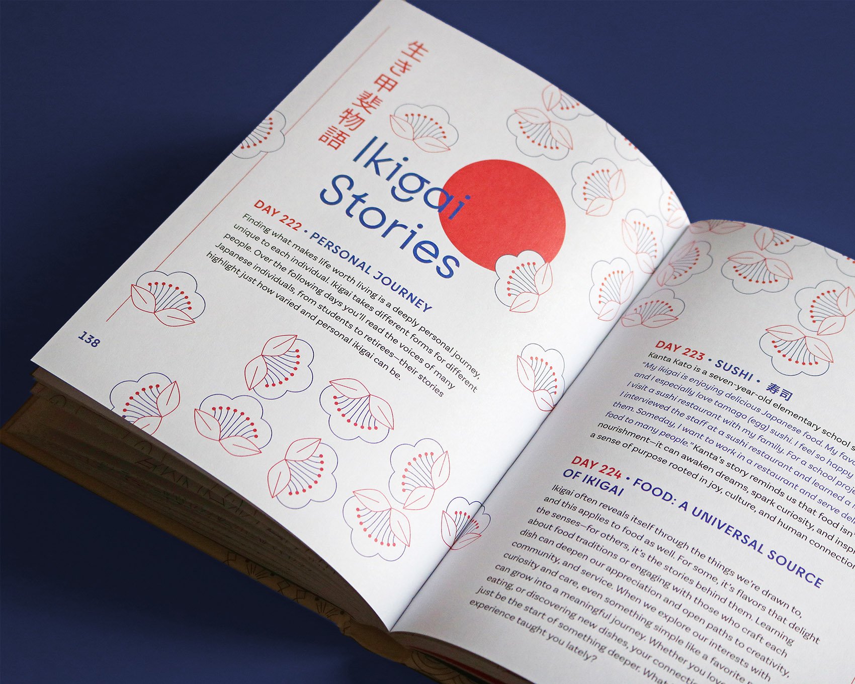
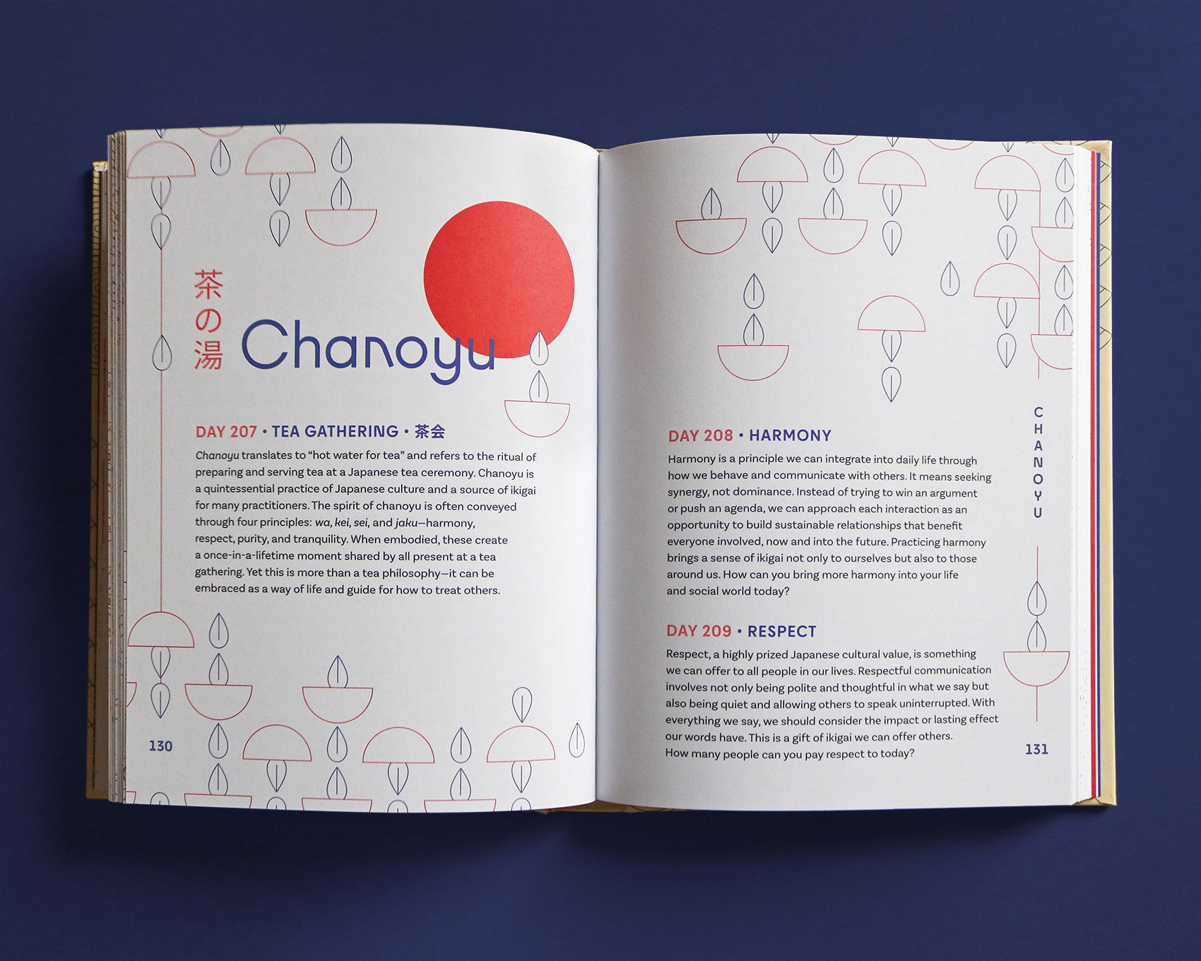
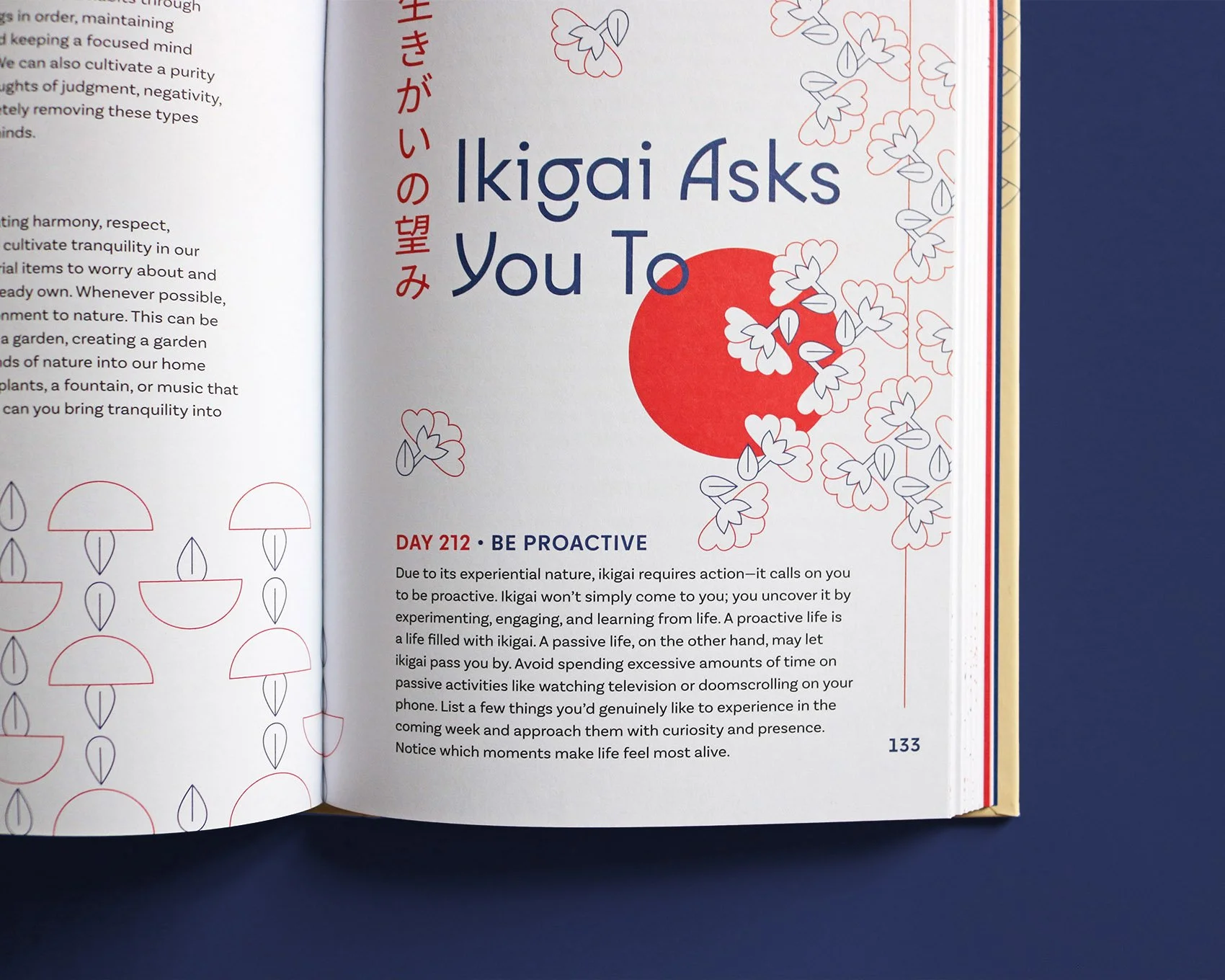
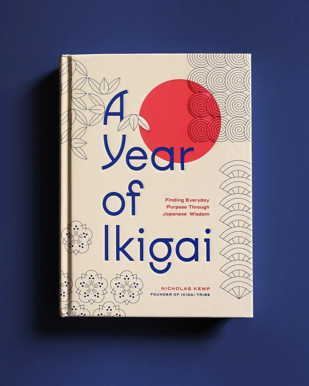
A Year of Ikigai is a collection of short and simple daily readings for finding everyday purpose through Japanese philosophy. Geometric patterns, inspired by traditional Japanese decorative elements, characterize each chapter.
Book published by Quarto US