pattern
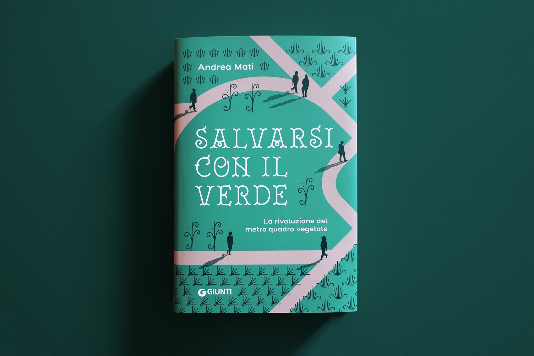
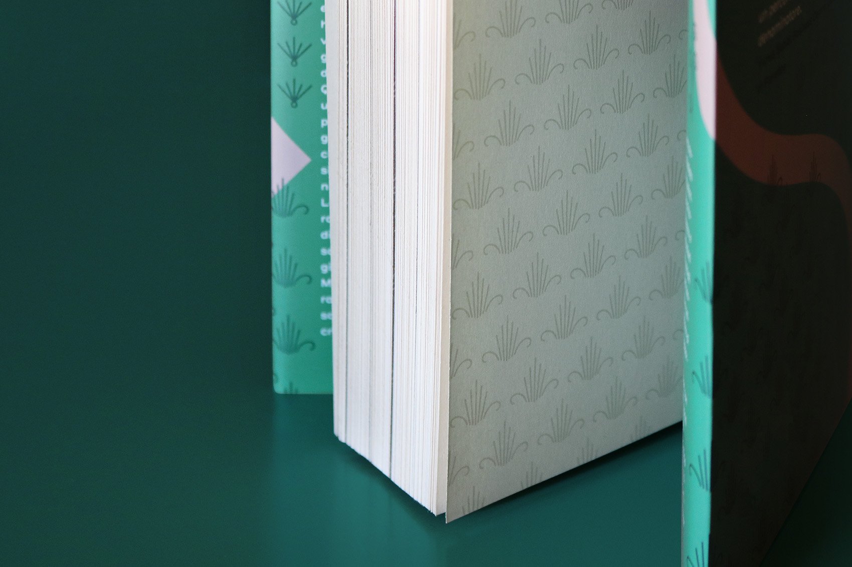
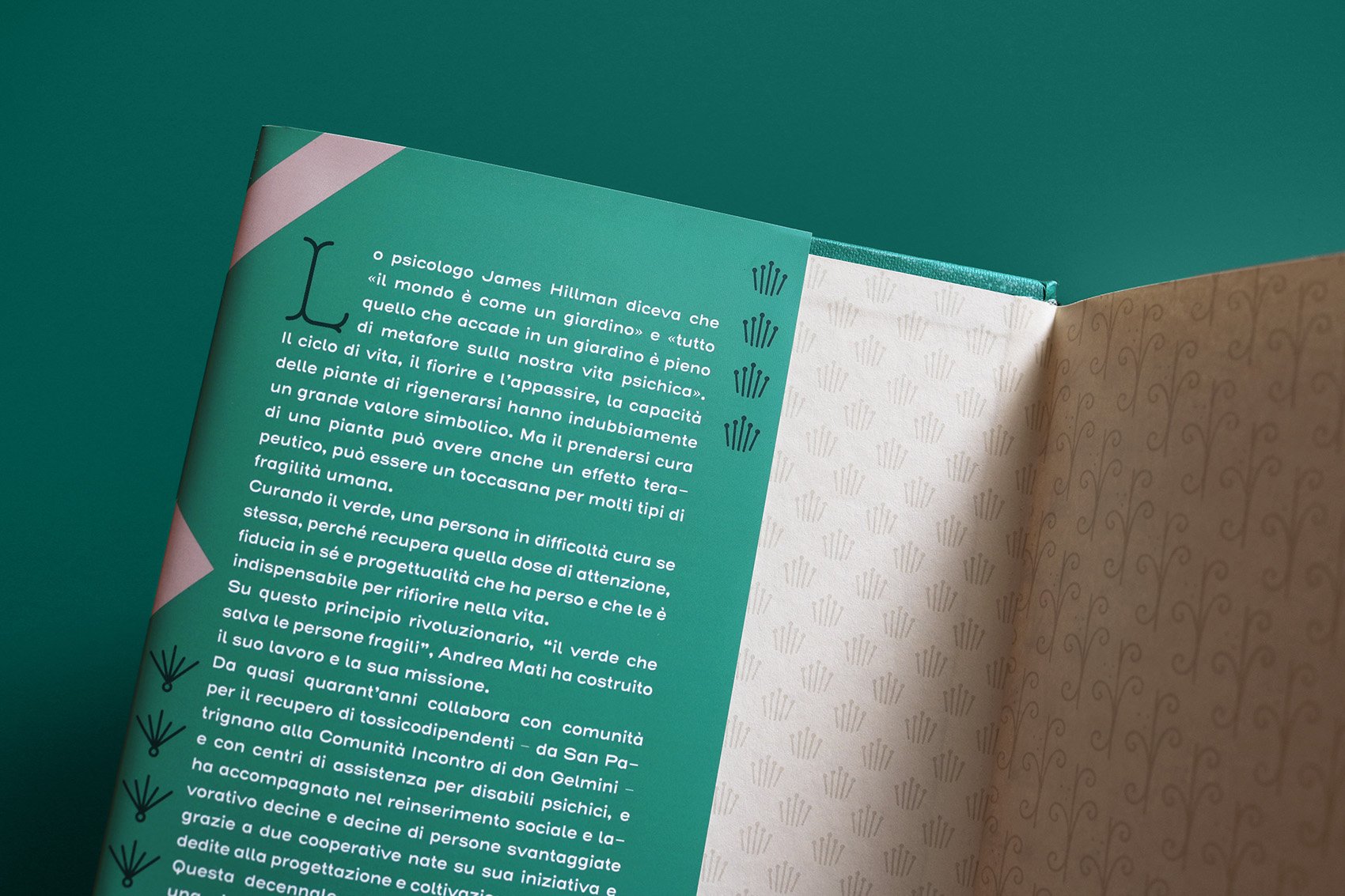
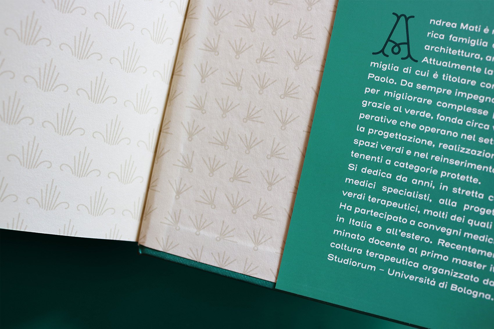
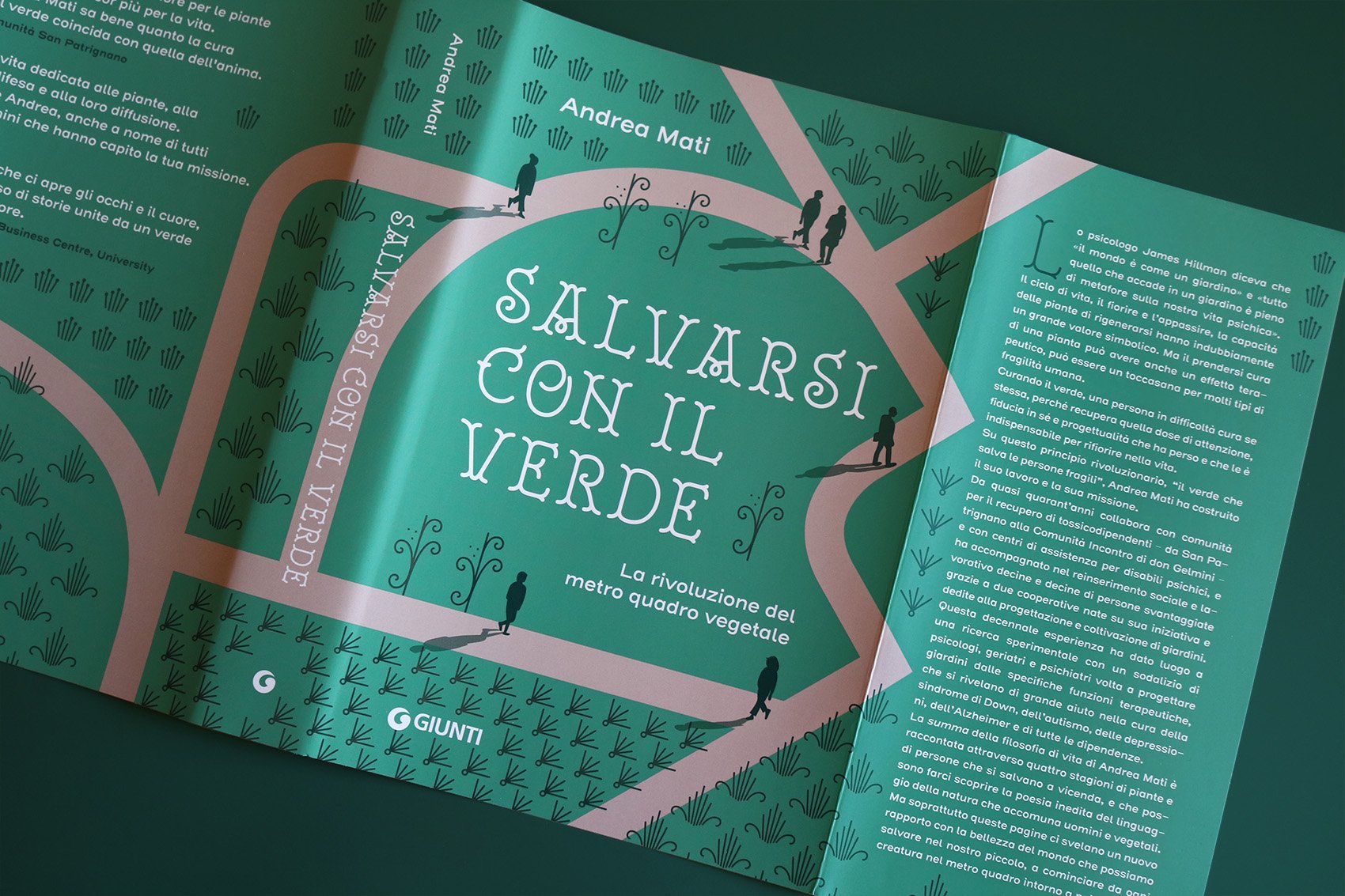
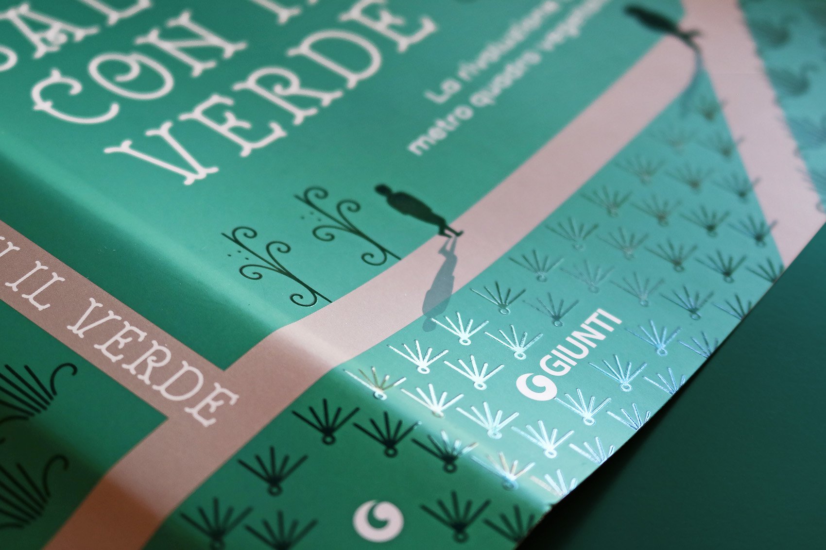
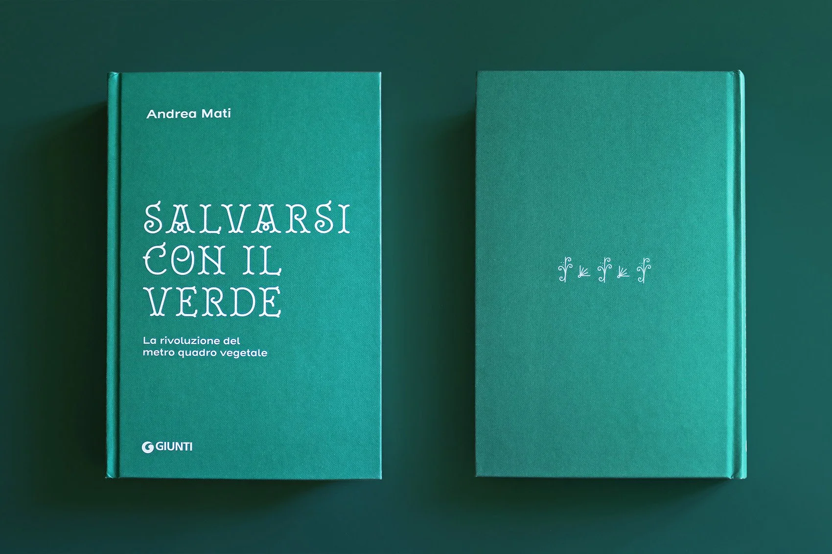
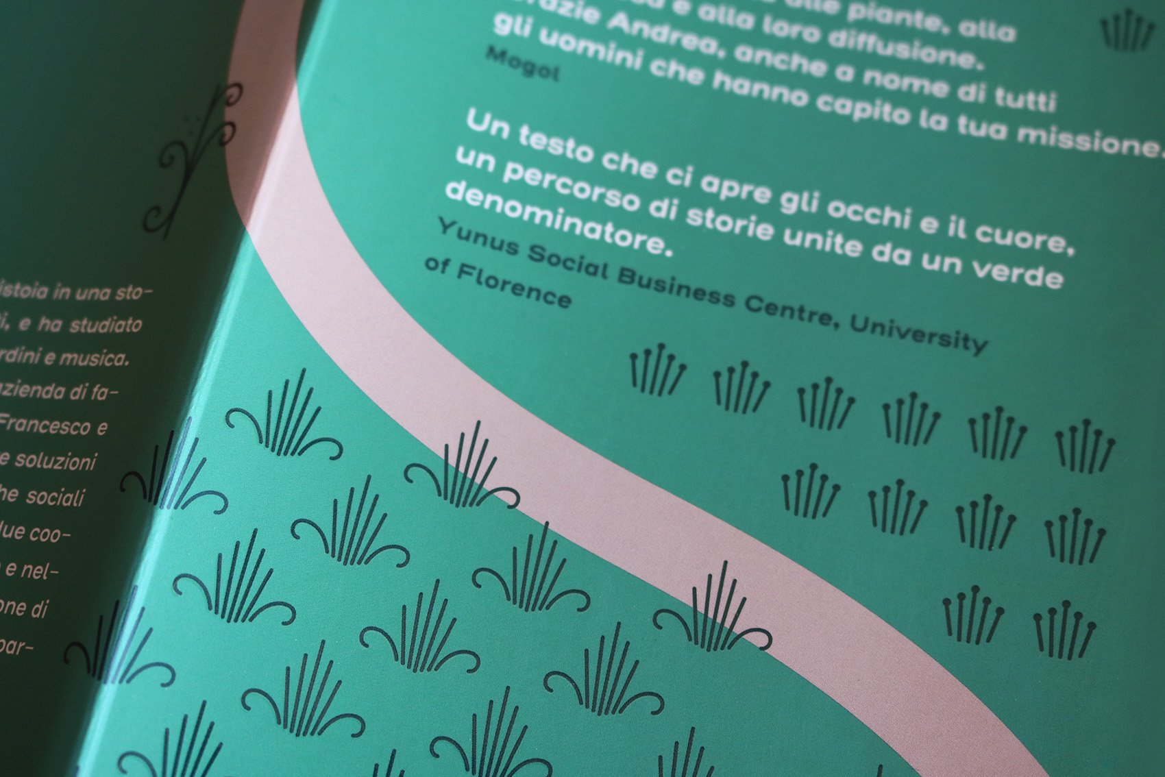
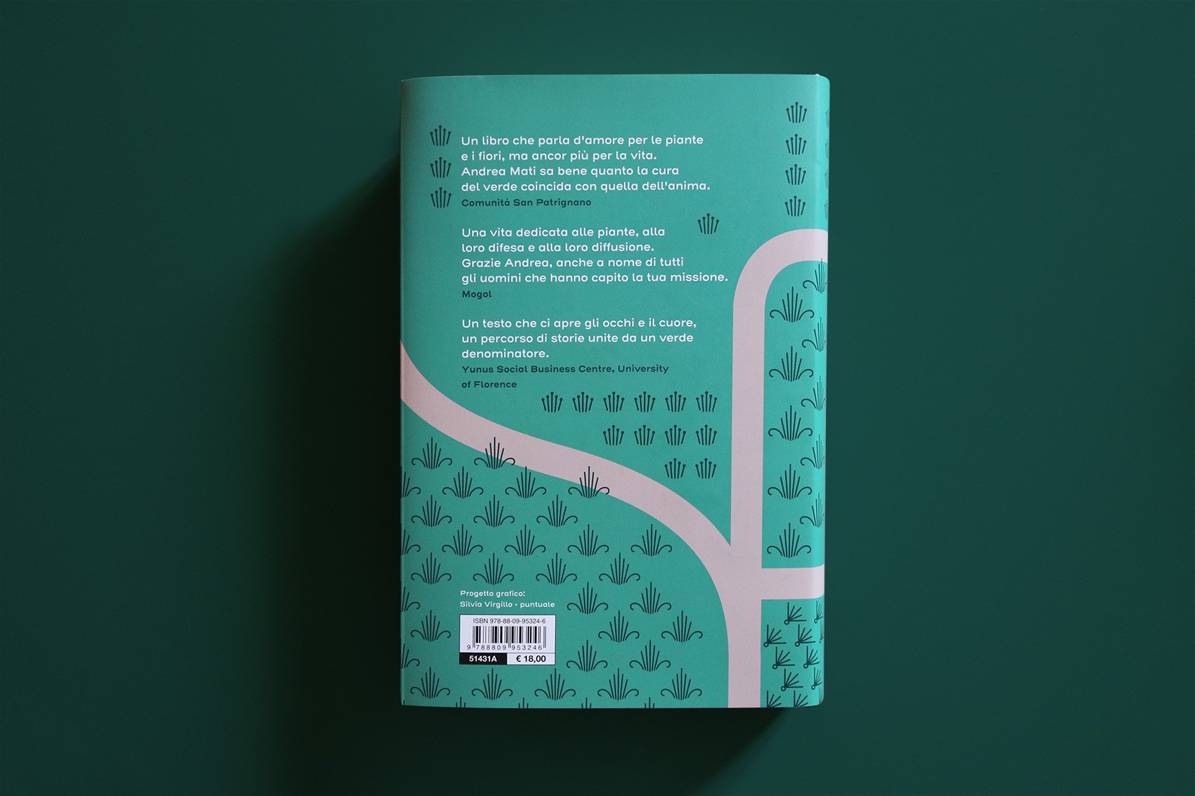
Salvarsi con il verde
/ book cover design /
A book dedicated to gardens and plants, to understand how the green-care can improve human life.
Publisher: Giunti Editore
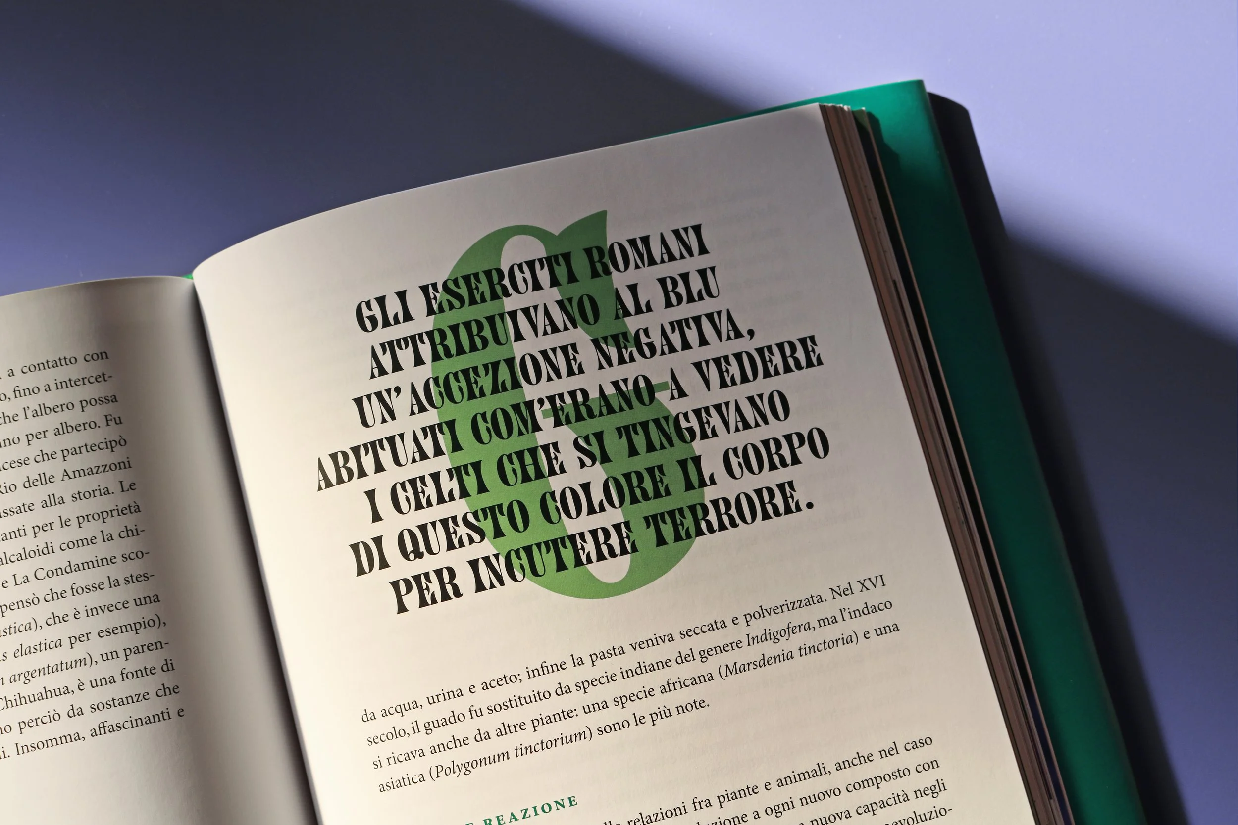
Capital letters and ornamental glyphs: Royale font by Resistenza

Ci vuole un fiore
/ editorial design / book layout /
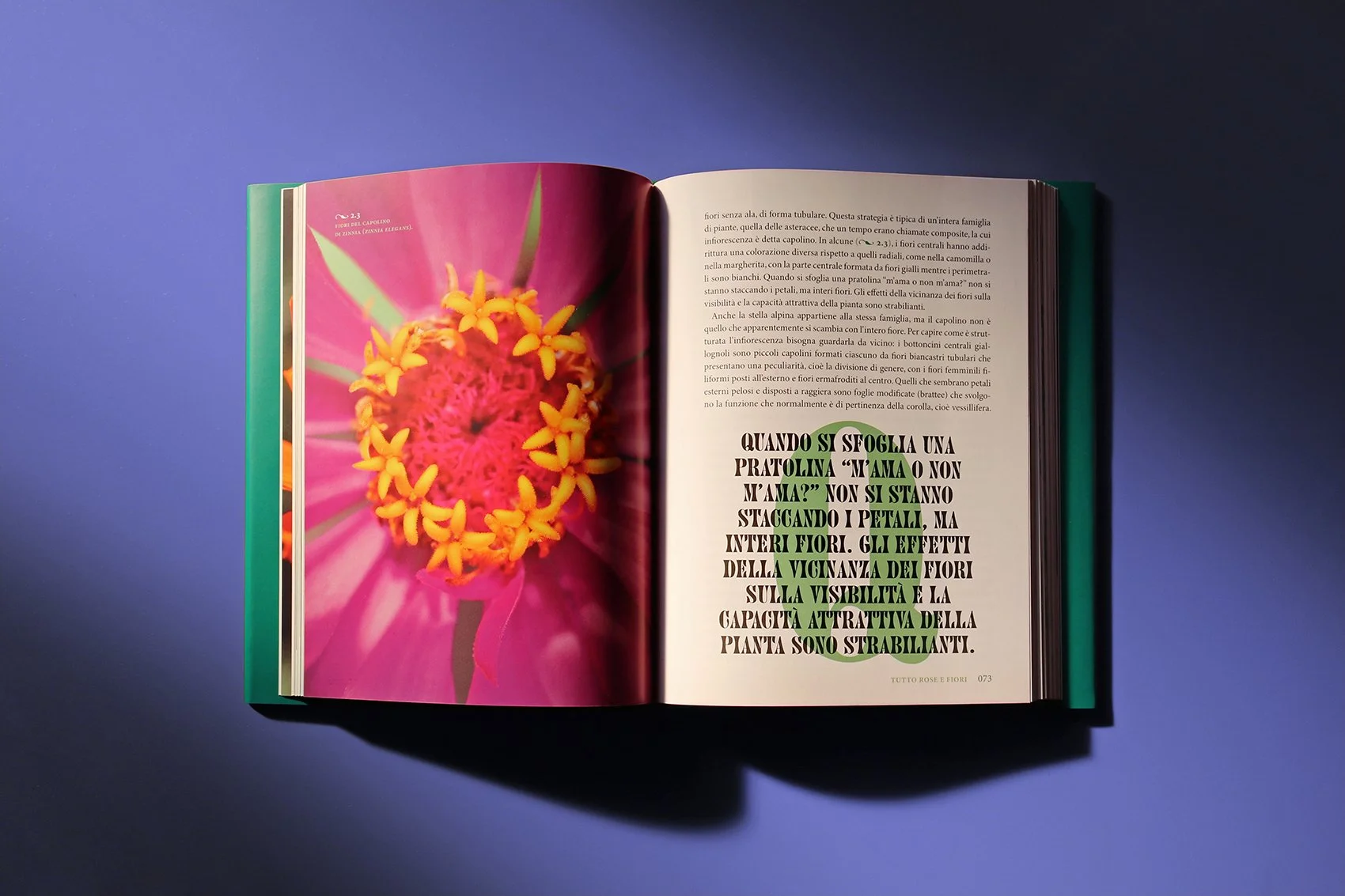
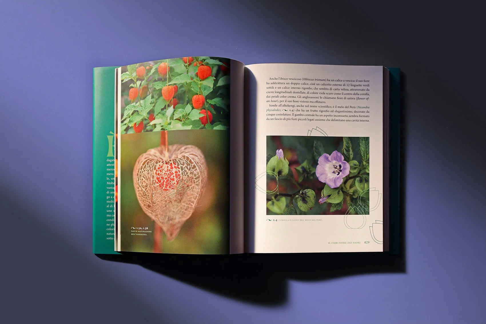
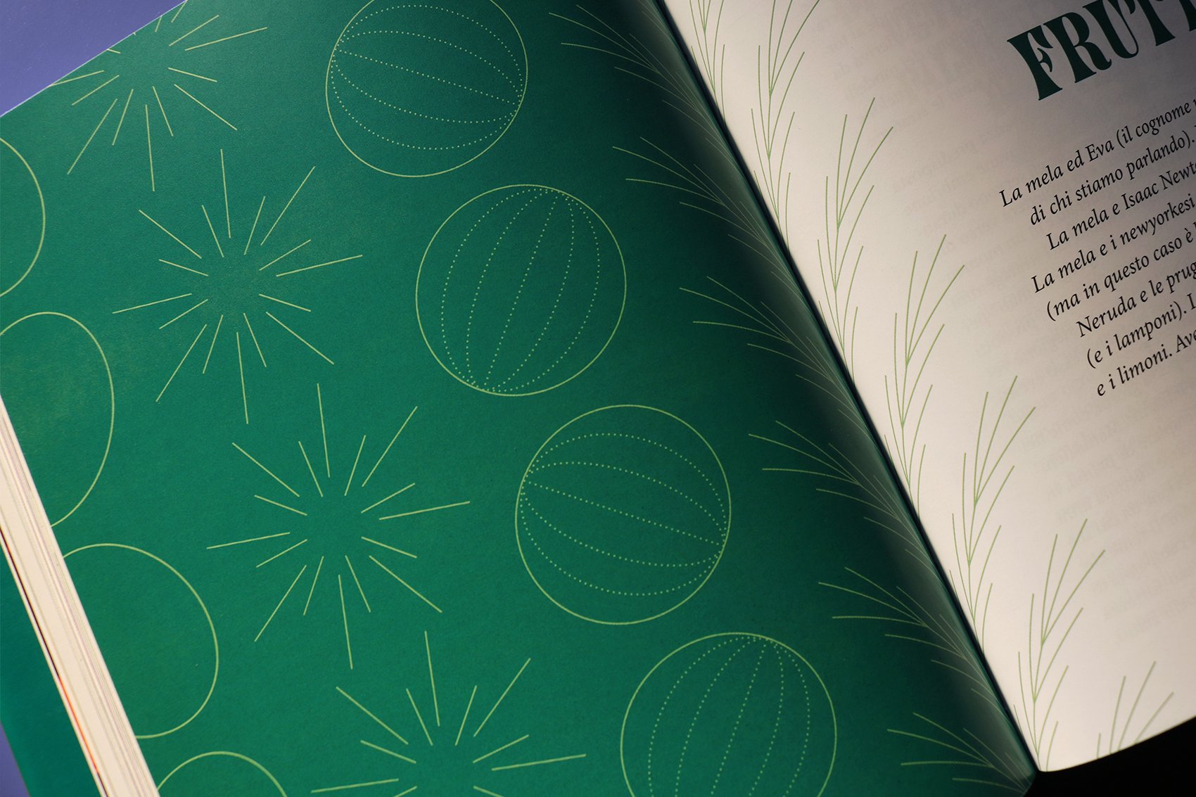
The kingdom Plantae offers wonderful stories. Ci vuole un fiore is a book that reveals the natural beauty of flowers and plants, enriched by photographs, graphic elements and patterns.
Plant photography: Eleonora Marchi
Publisher: Codice Edizioni
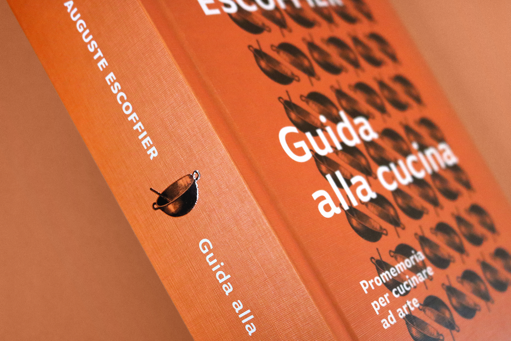
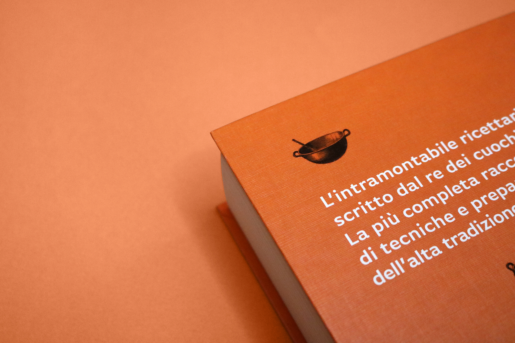
Guida alla cucina
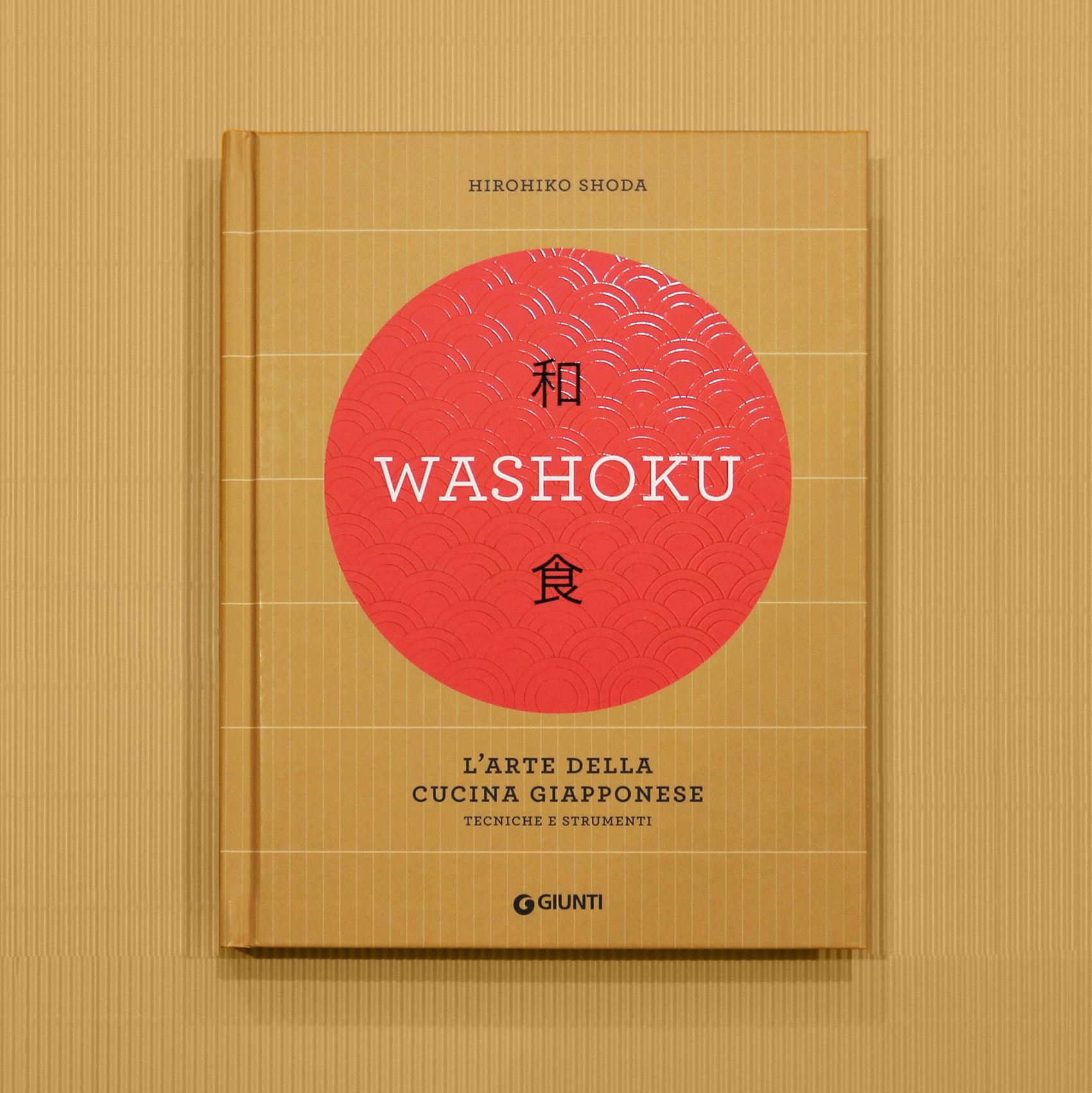
Washoku
/ book cover design /
A precious book about Japanese cuisine, written by Chef Hiro.
Publisher: Giunti Editore

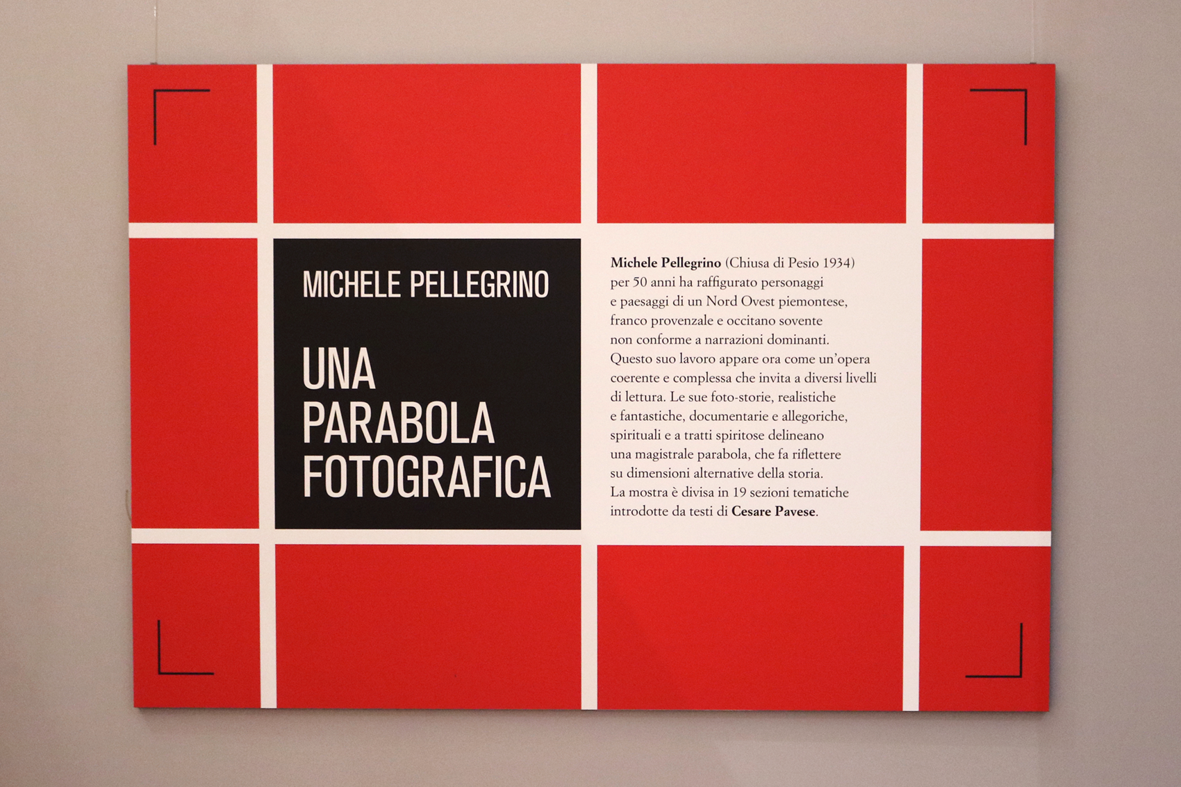
Michele Pellegrino - Una parabola fotografica
/ exhibition design /
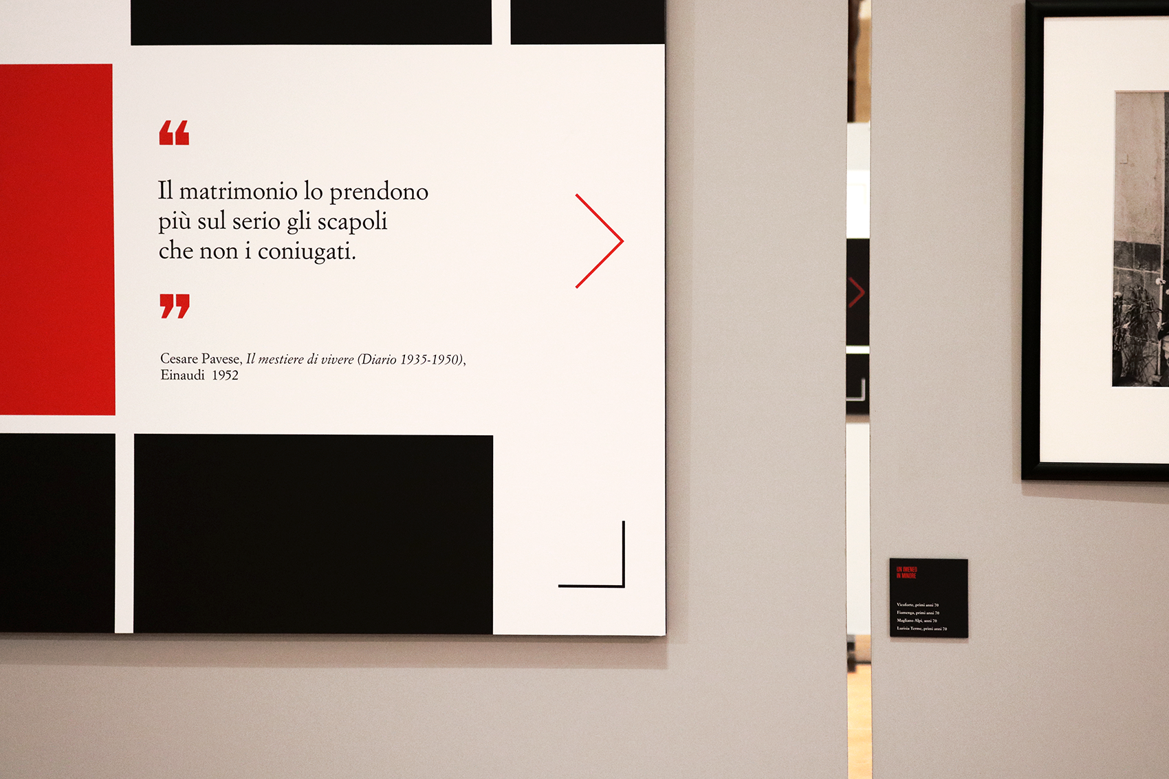
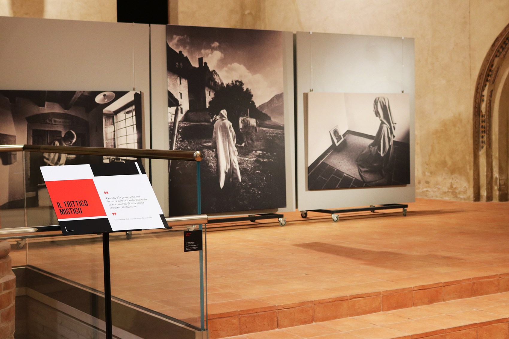
The photographic exhibition is about Michele Pellegrino's work and has the particularity of being introduced by Cesare Pavese quotes. These texts are focused on a symbolic vision of human existence, common theme in Pellegrino's work.
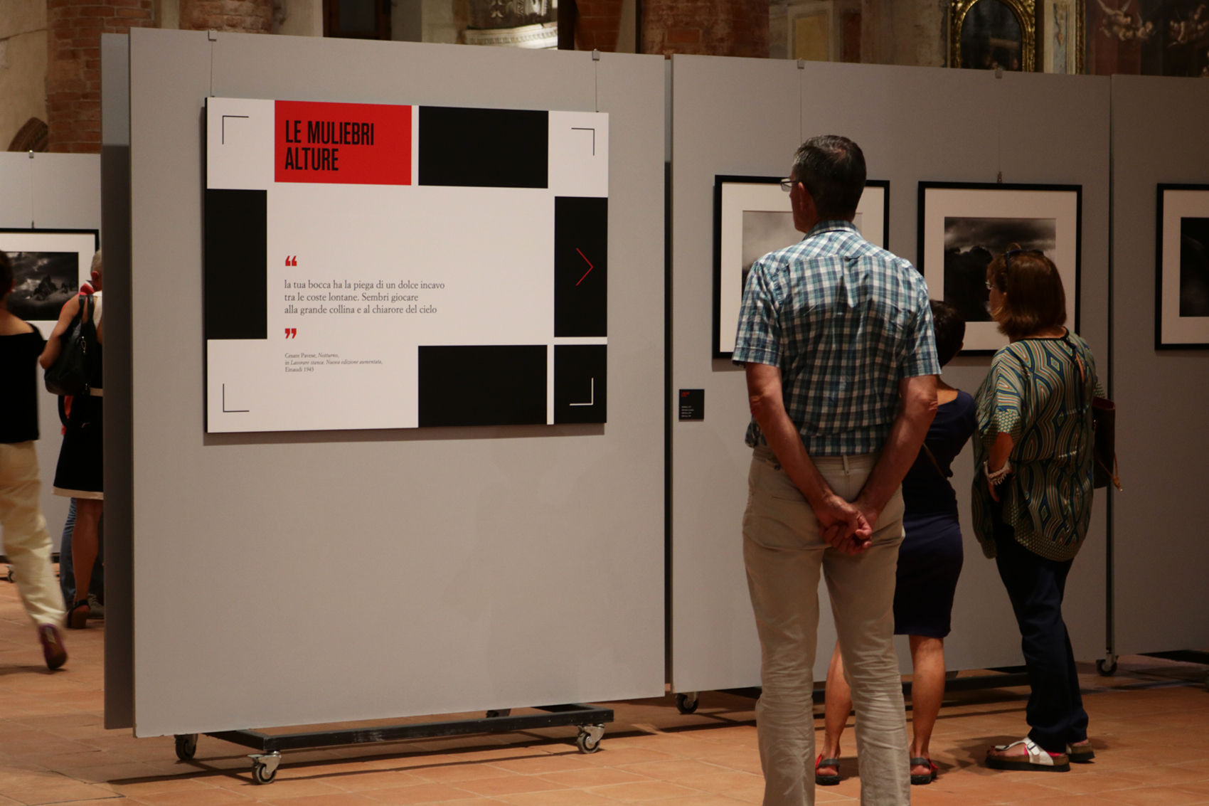
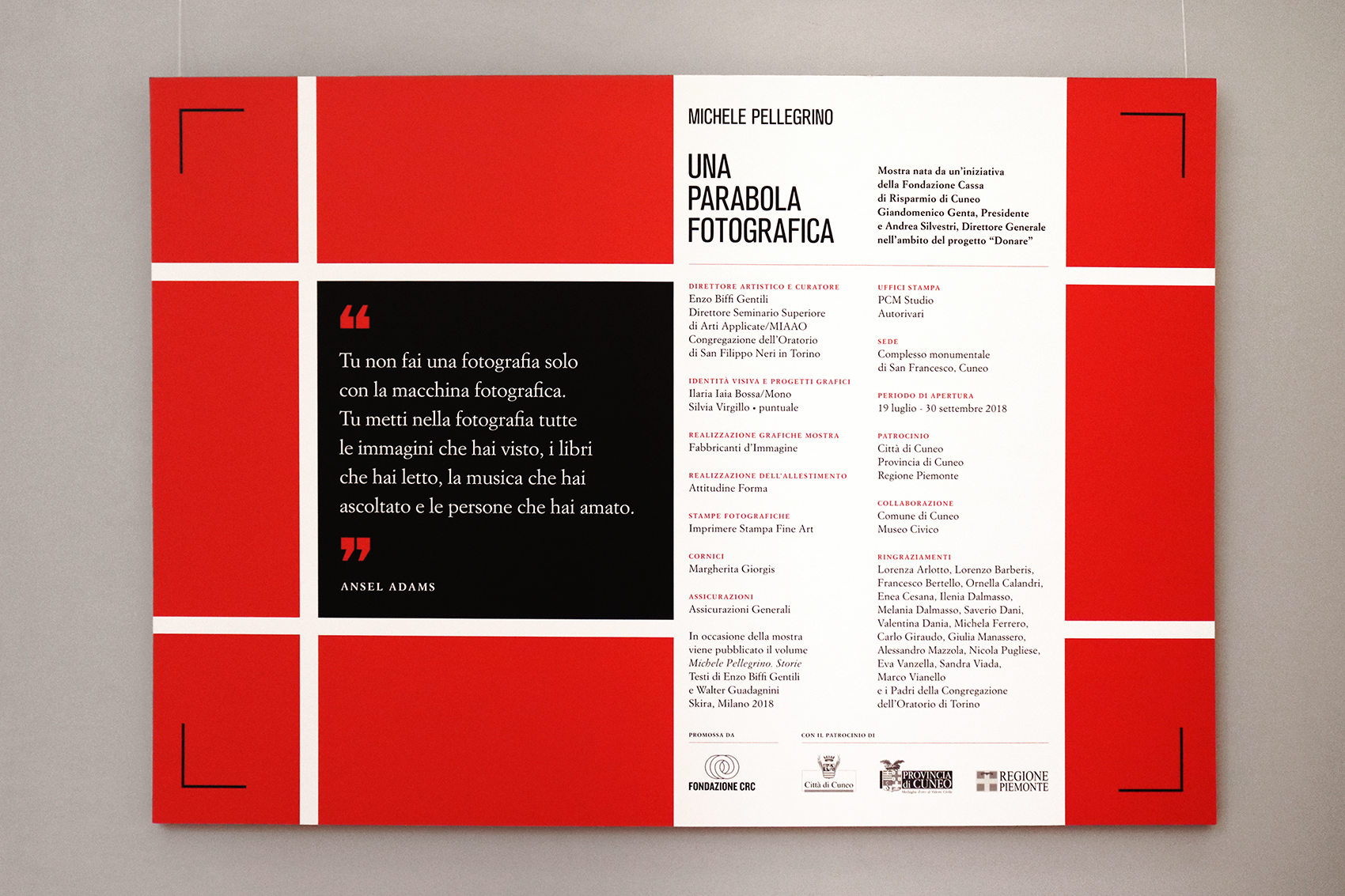
The graphic project focuses on this literary juxtapposition and takes visual inspiration from Italian editorial masterpieces: Bruno Munari squares (designed for Einaudi, Pavese’s publisher) and Simoncini Garamond are rearranged in a grid that seems both an editorial layout and a photographic frame.
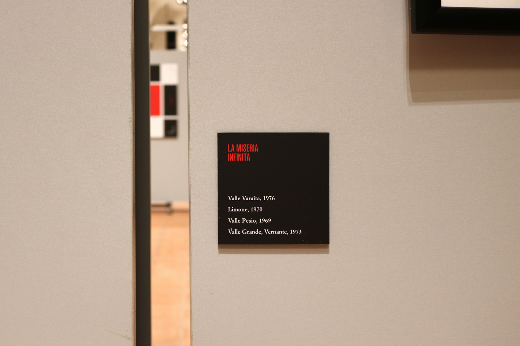
The project highlights the thematic sections, giving visual relevance to the literary quotes that introduce the pictures.
July 19 - September 30, 2018
Complesso monumentale di San Francesco, Cuneo
Curated by Vincenzo Biffi Gentili and promoted by Fondazione CRC
Come si dice pattern in italiano?
/ pattern design /
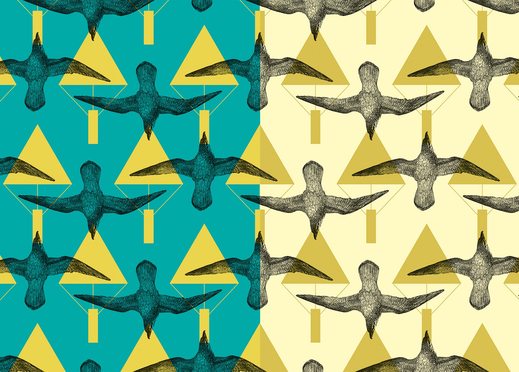
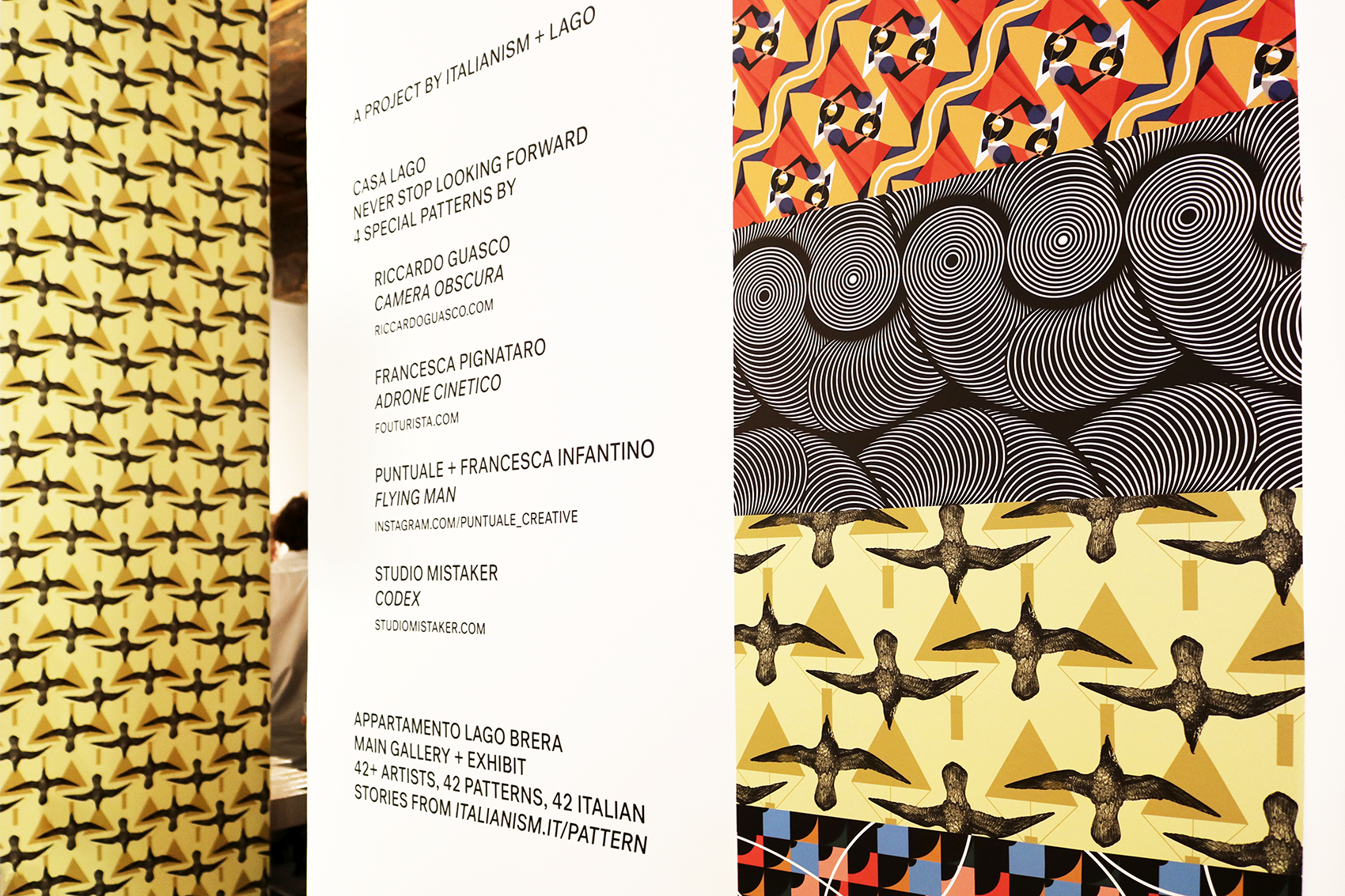
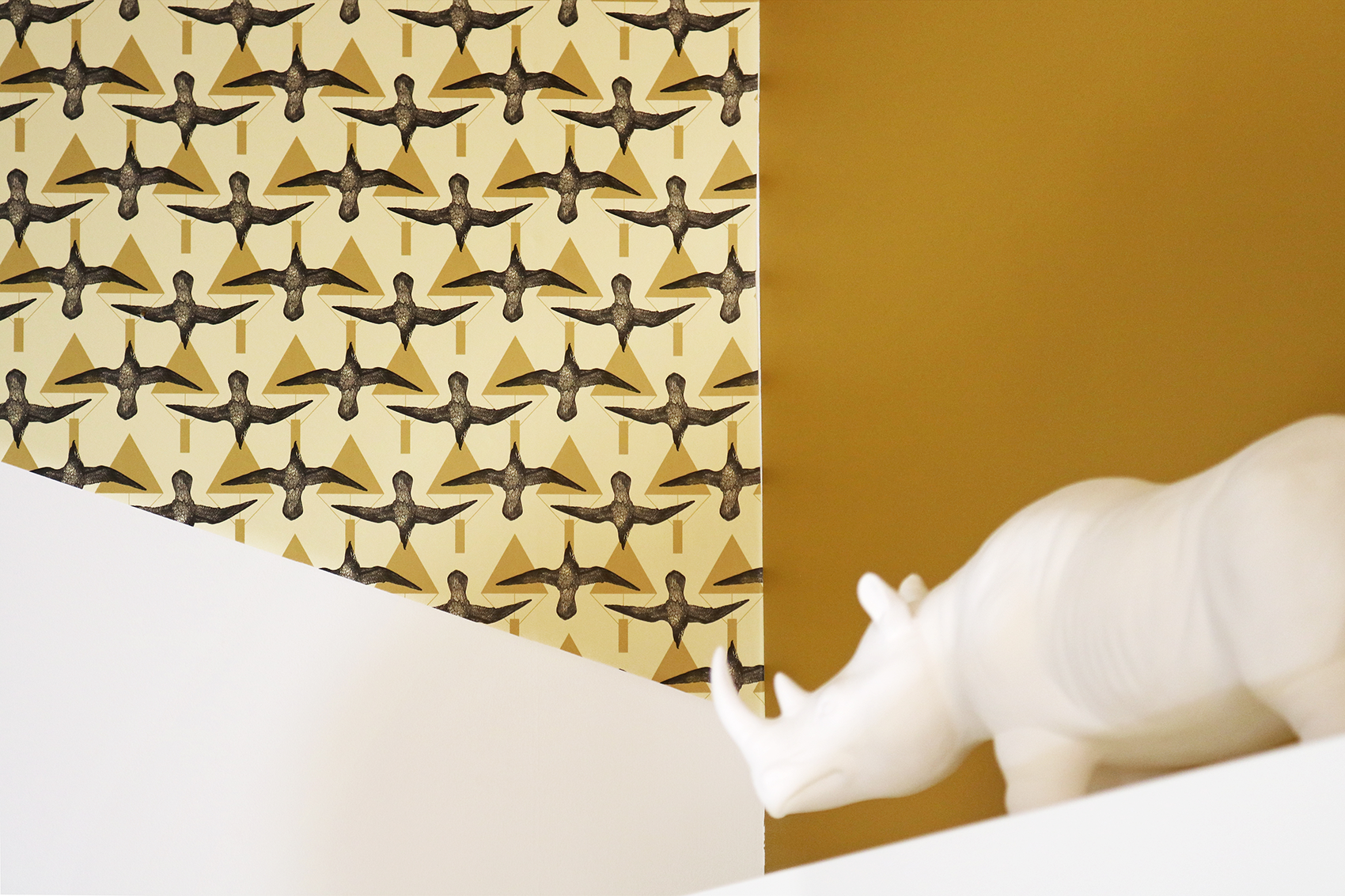
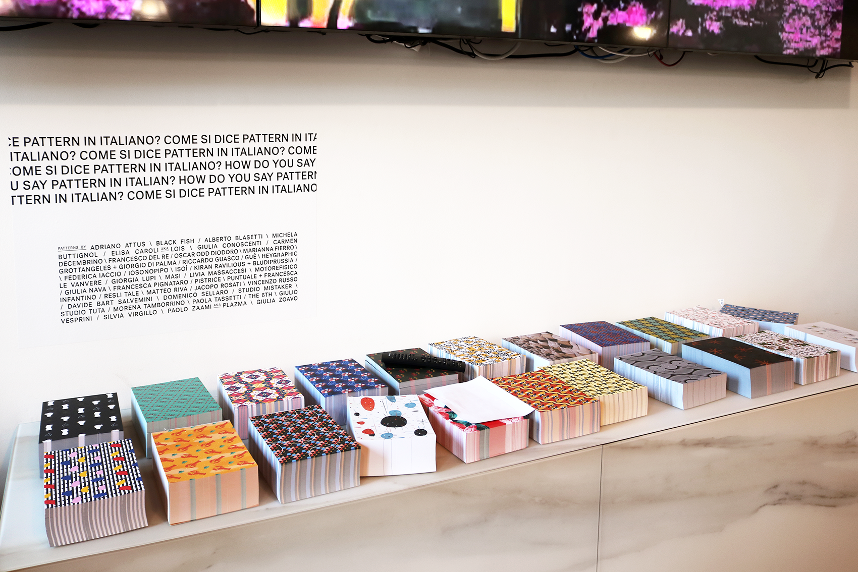
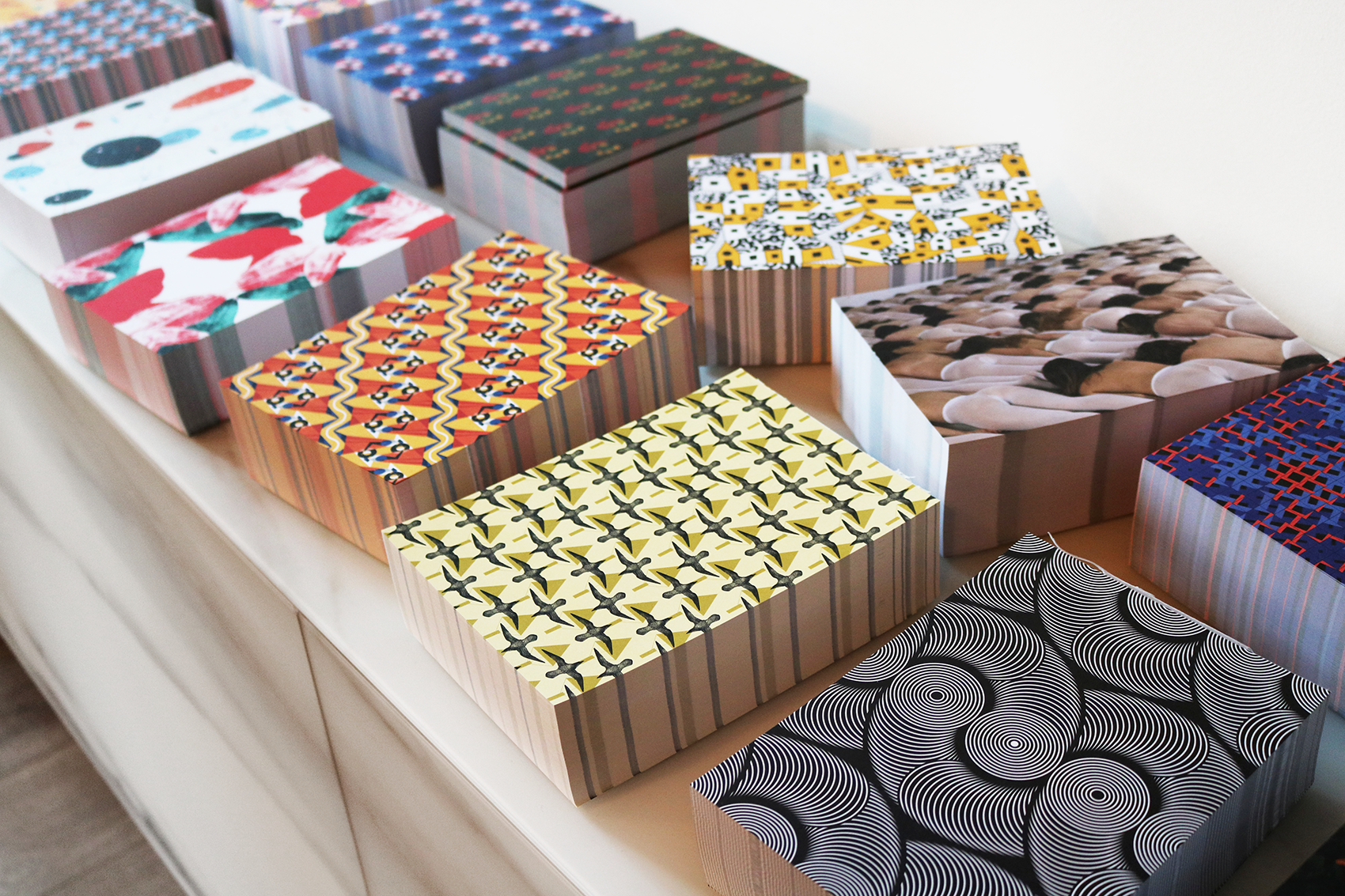
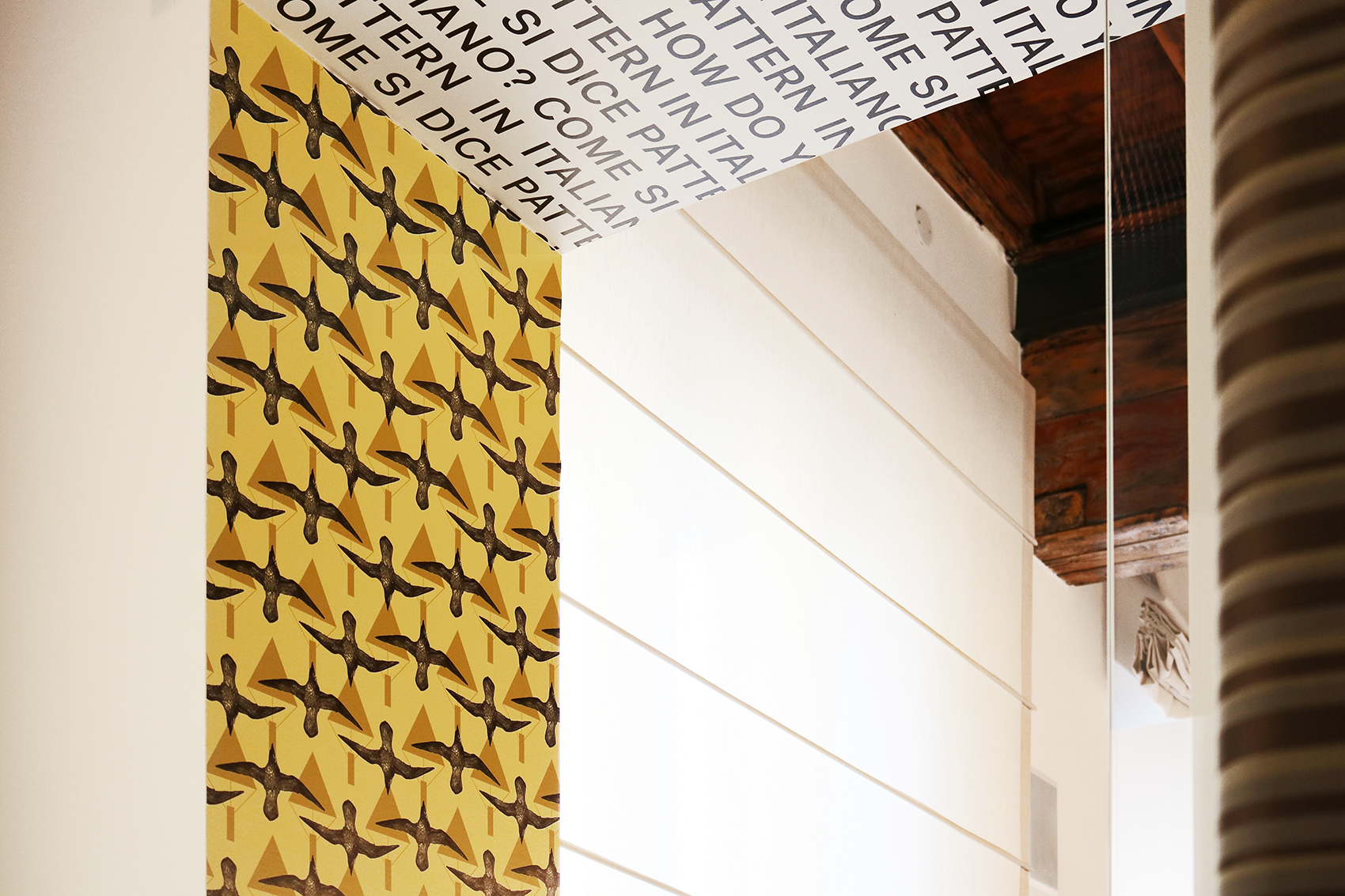
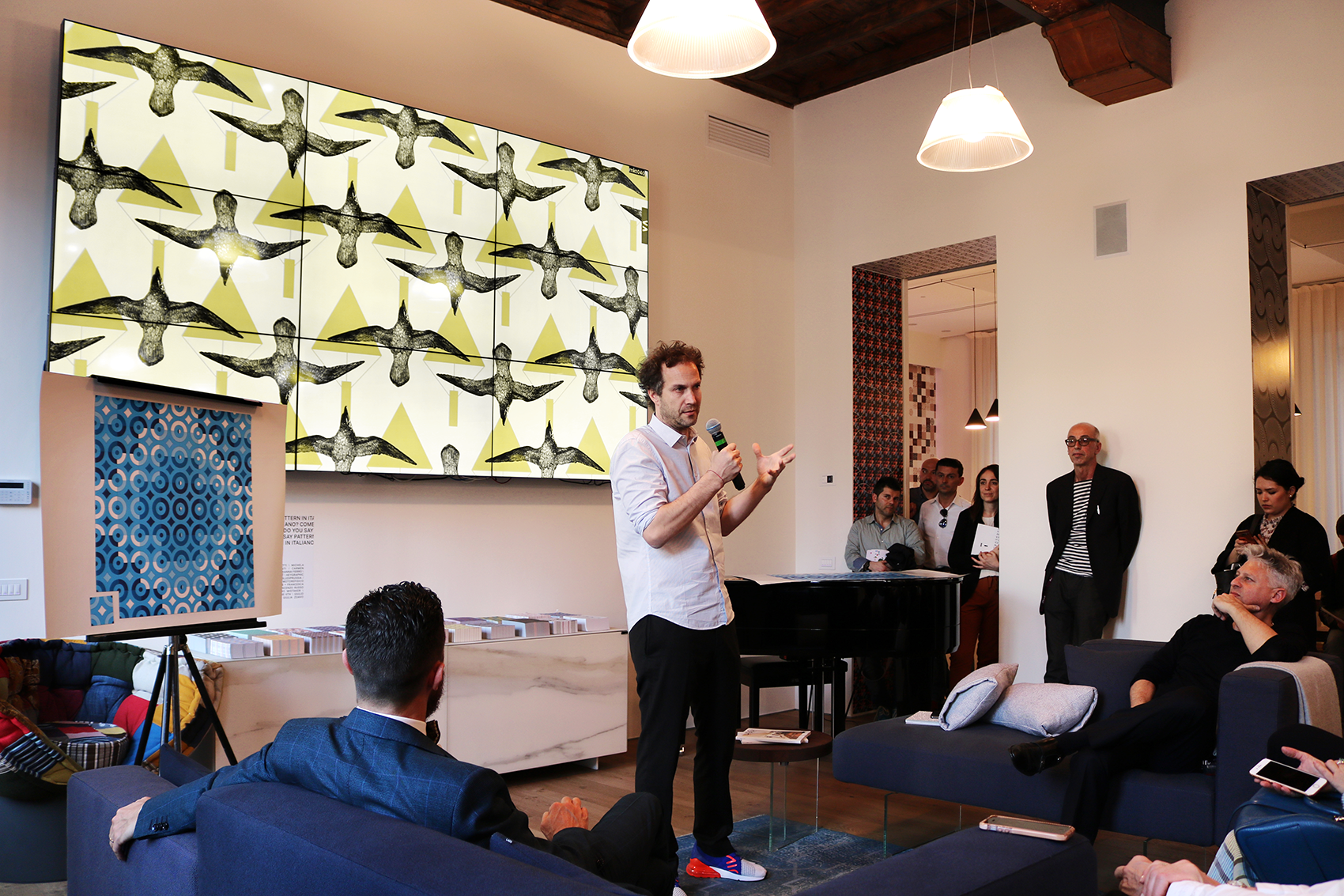
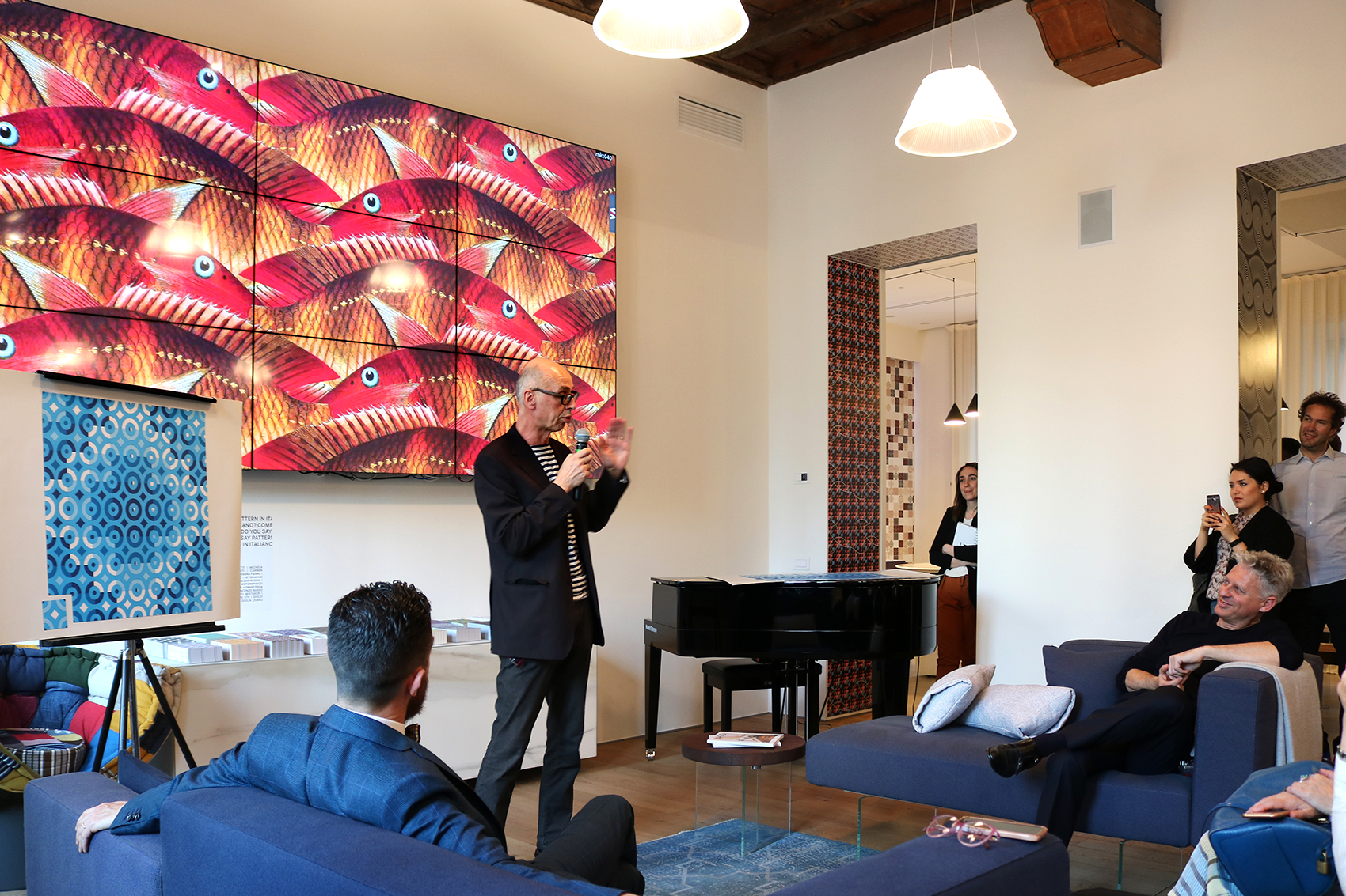
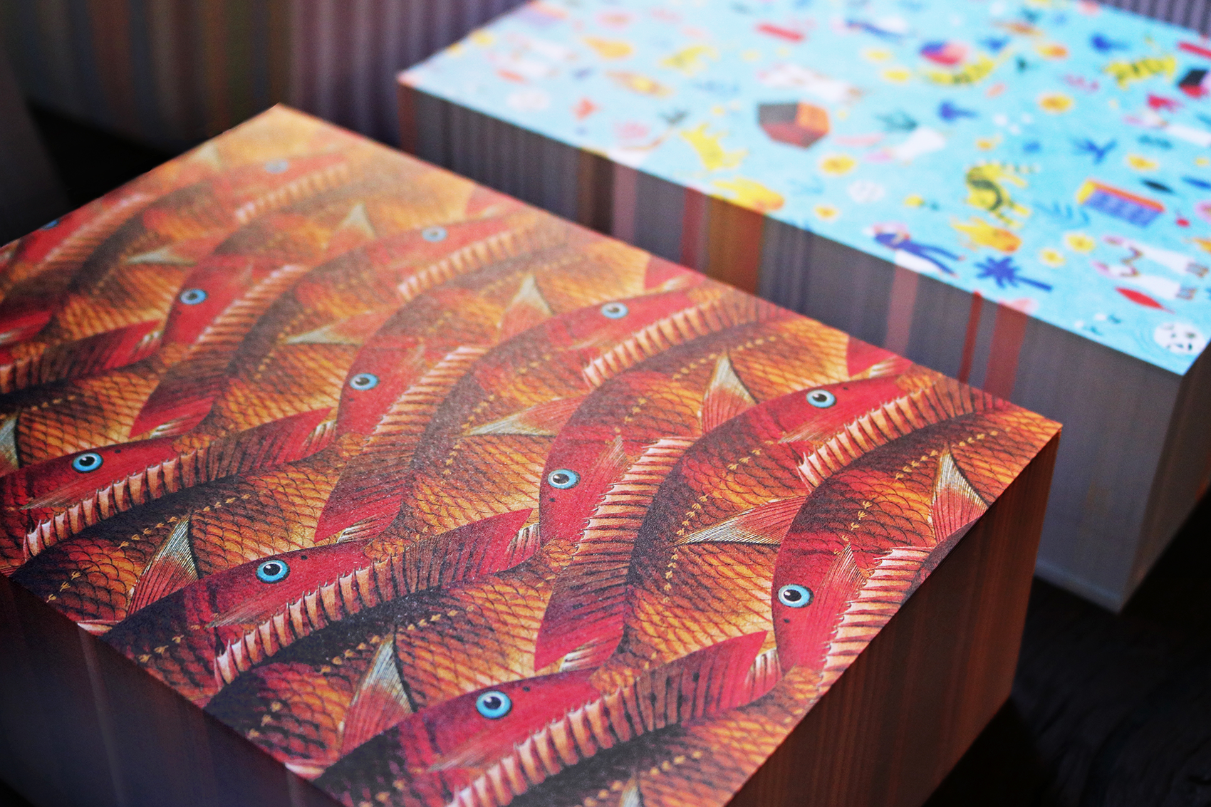
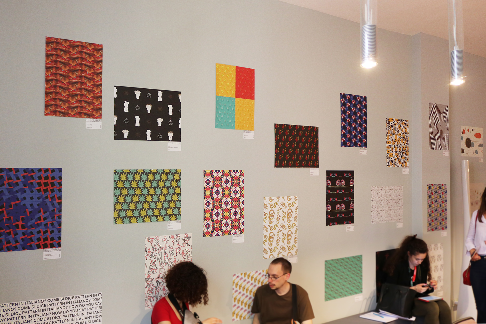
A selection of some emerging visual artists finds its home in Milan during Design Week, in a project by Italianism (Renato Fontana) and Lago. Come si dice pattern in italiano? is an exhibition that dresses two locations with a selection of 41 patterns.
I've been asked together with Francesca Infantino to design one of the four special artworks dedicated to Leonardo da Vinci, in response to LAGO’s invitation to look beyond, drawing inspiration from the insatiable curiosity of the genius himself. And here's our Flying Man, inspired by the flight and the studies Leonardo did on the parachute.
In the same exhibition all the artworks designed for Italianism's Pattern Matters will become wallpapers and flyers to pick up freely. So come and take home my Patternittico, too.
Find them all at Appartamento Lago and Casa Lago during Milano Design Week 2018, in Brera District.
Lagom
/ book design /
Lagom Swedish lifestyle is centered on balance, simplicity and serenity. The book collects tips related to home-life, health and sustainability, represented by the four icons on cover and on title page.
Published by Giunti Editore
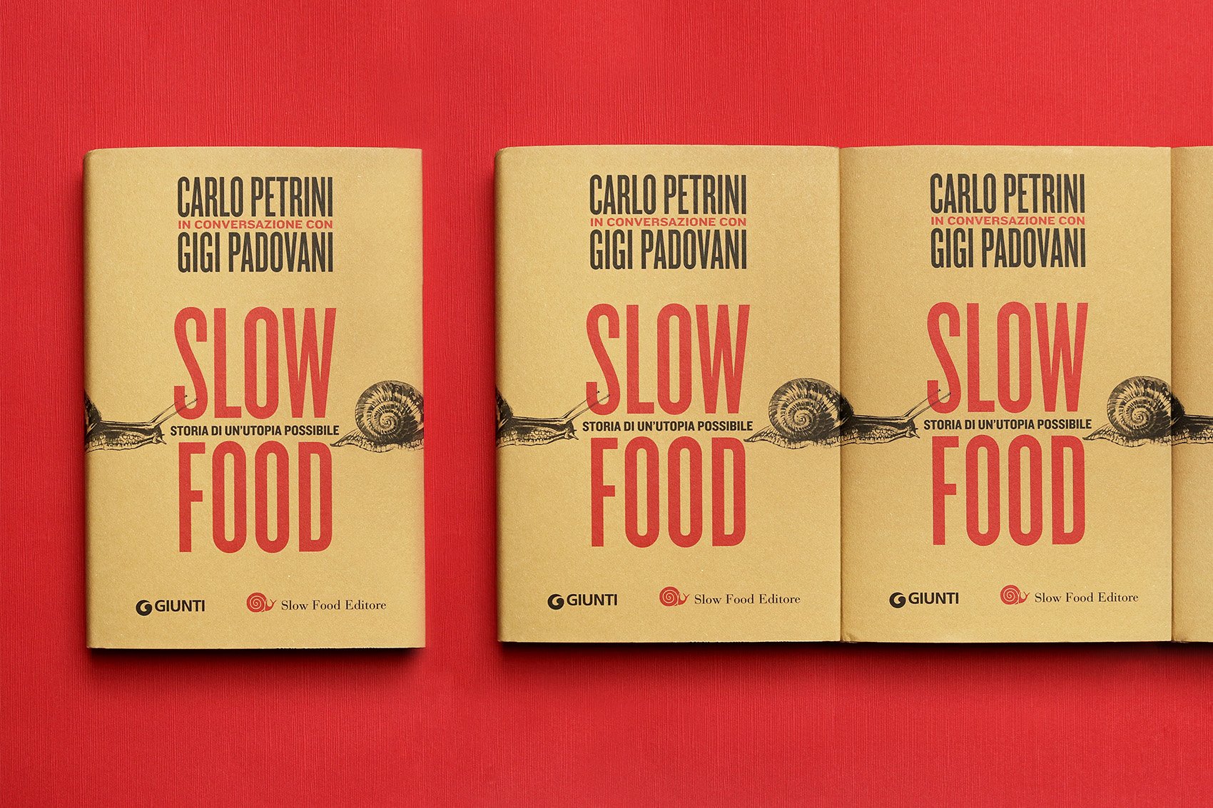
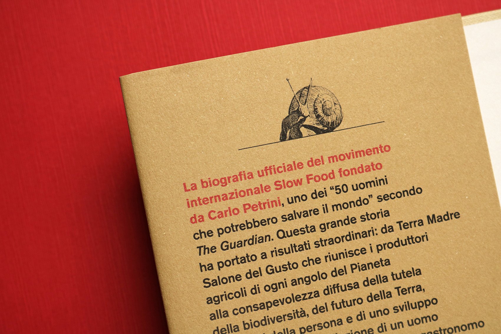
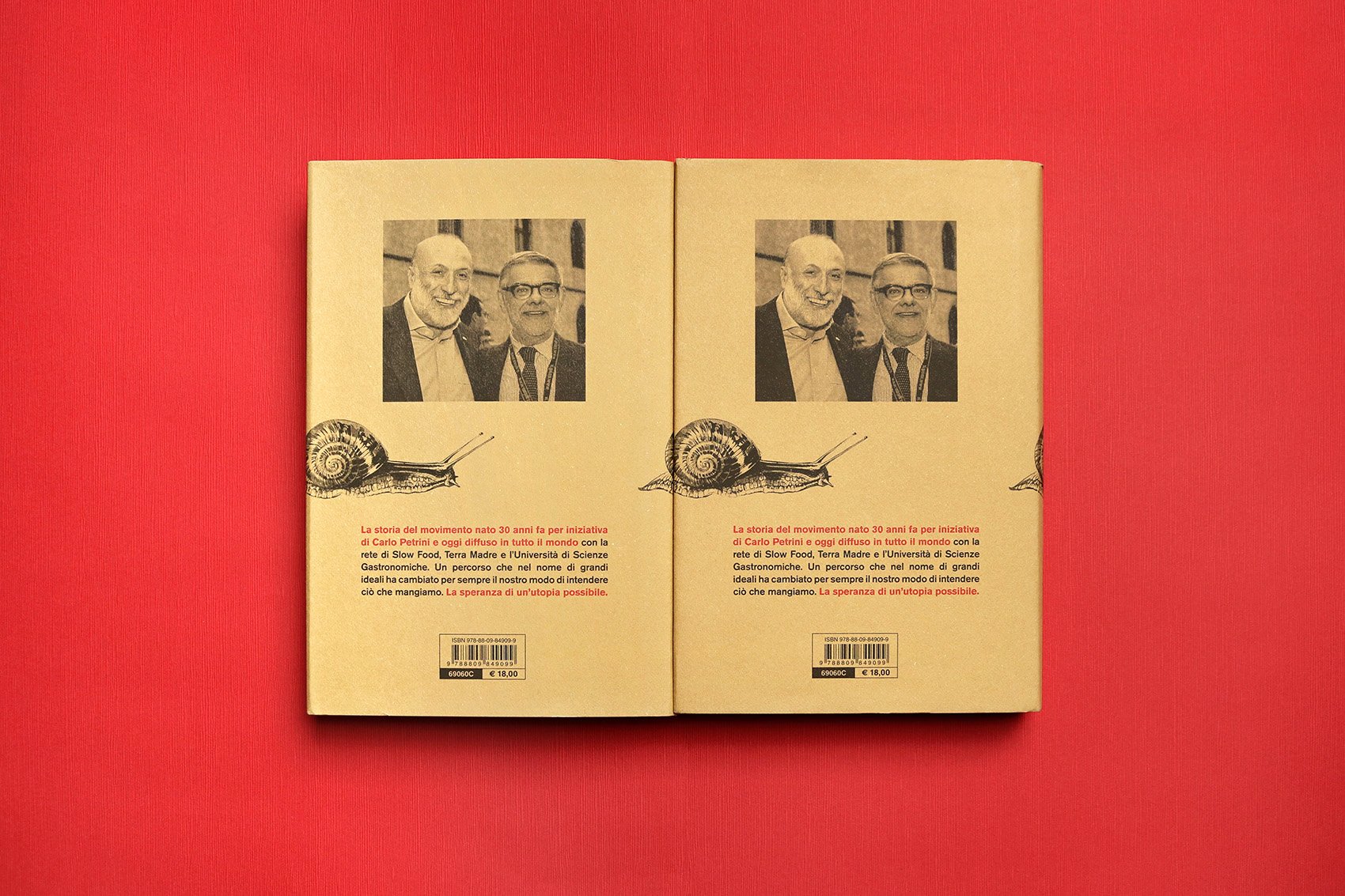
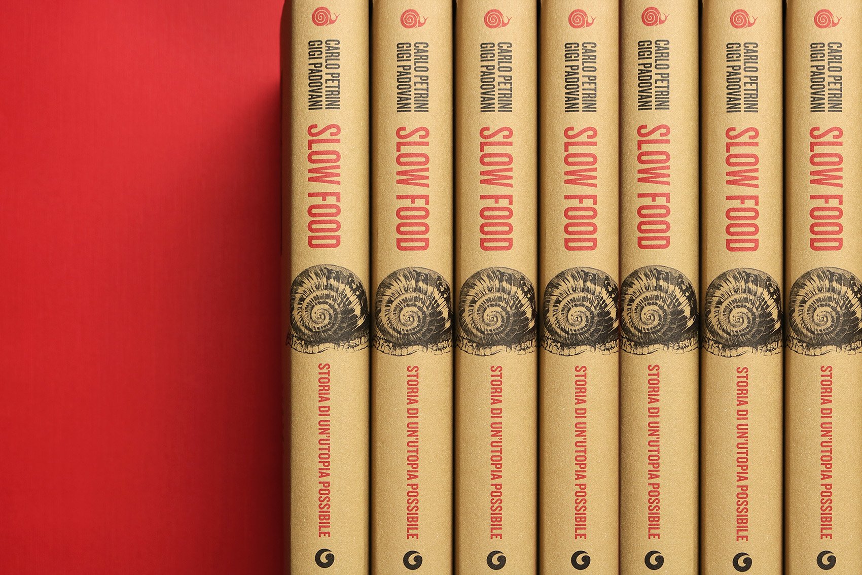
Slow Food. Storia di un’utopia possibile
/ book cover design /
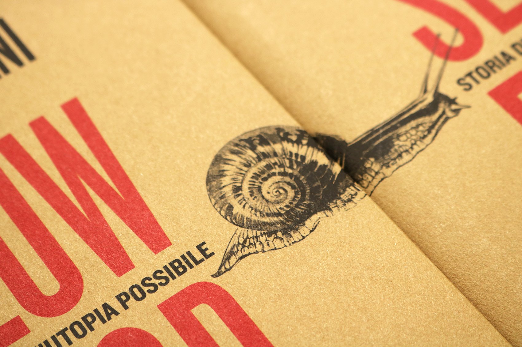
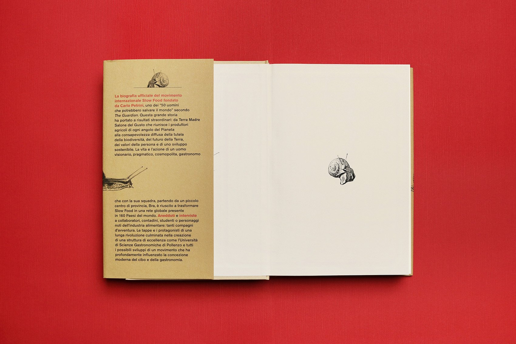
The movement founded by Carlo Petrini has become a global organization, spreading a new food philosophy. The book is about Slow Food history and its charismatic leader, one of the "50 men who could save the Planet" (The Guardian).
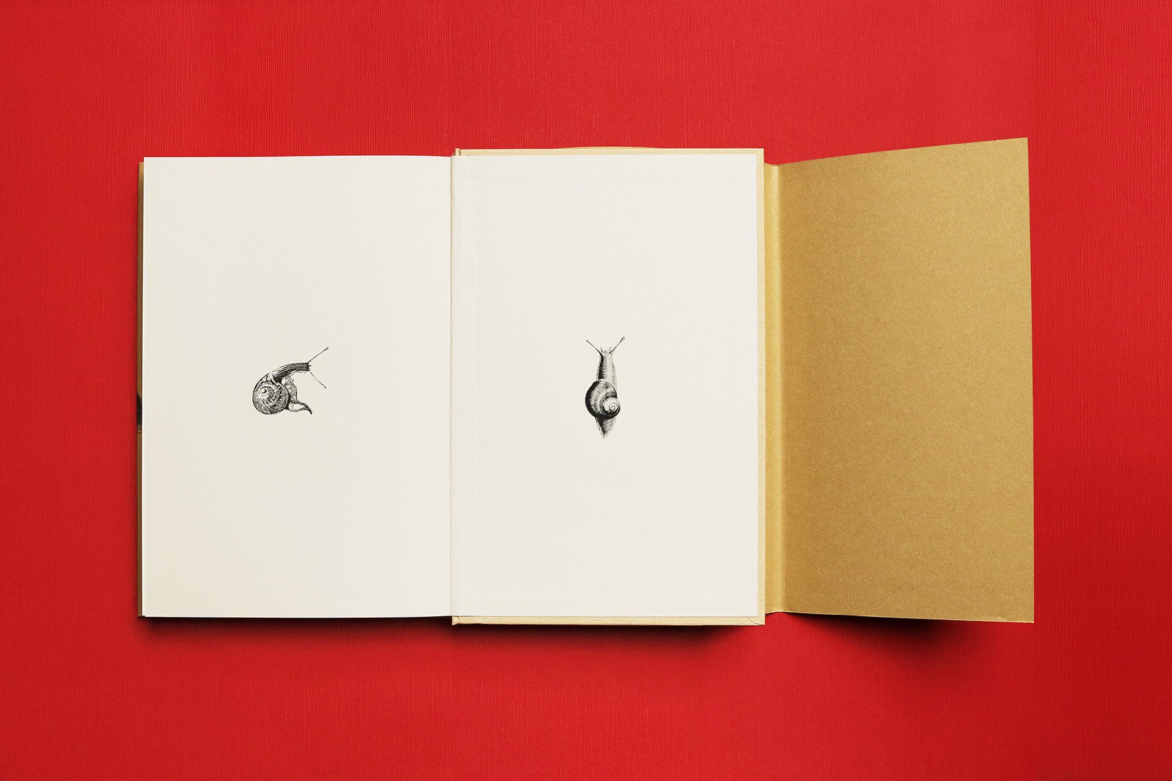
The story goes on and looks ahead, like the snail on the cover, in a continuous journey towards our future.
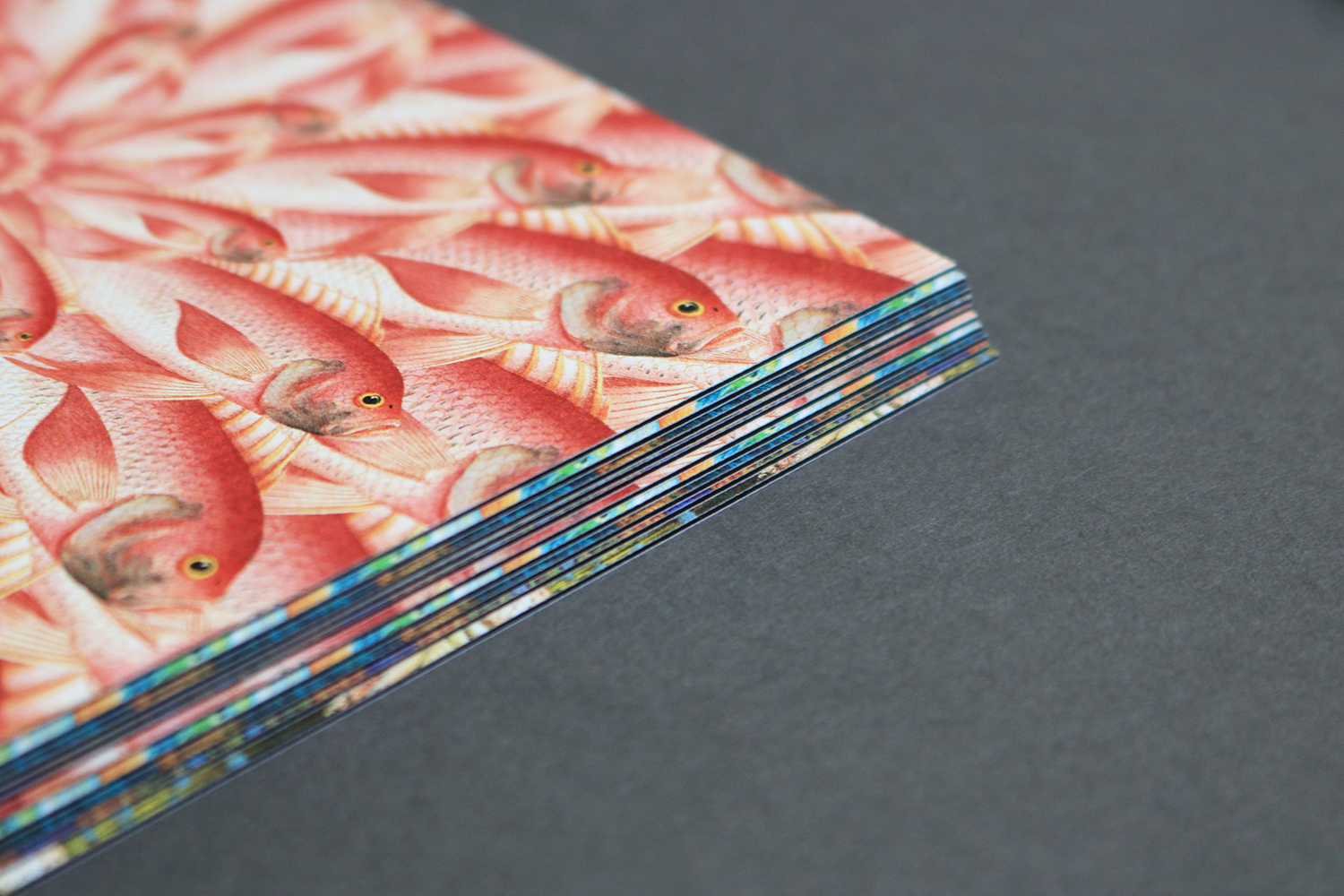
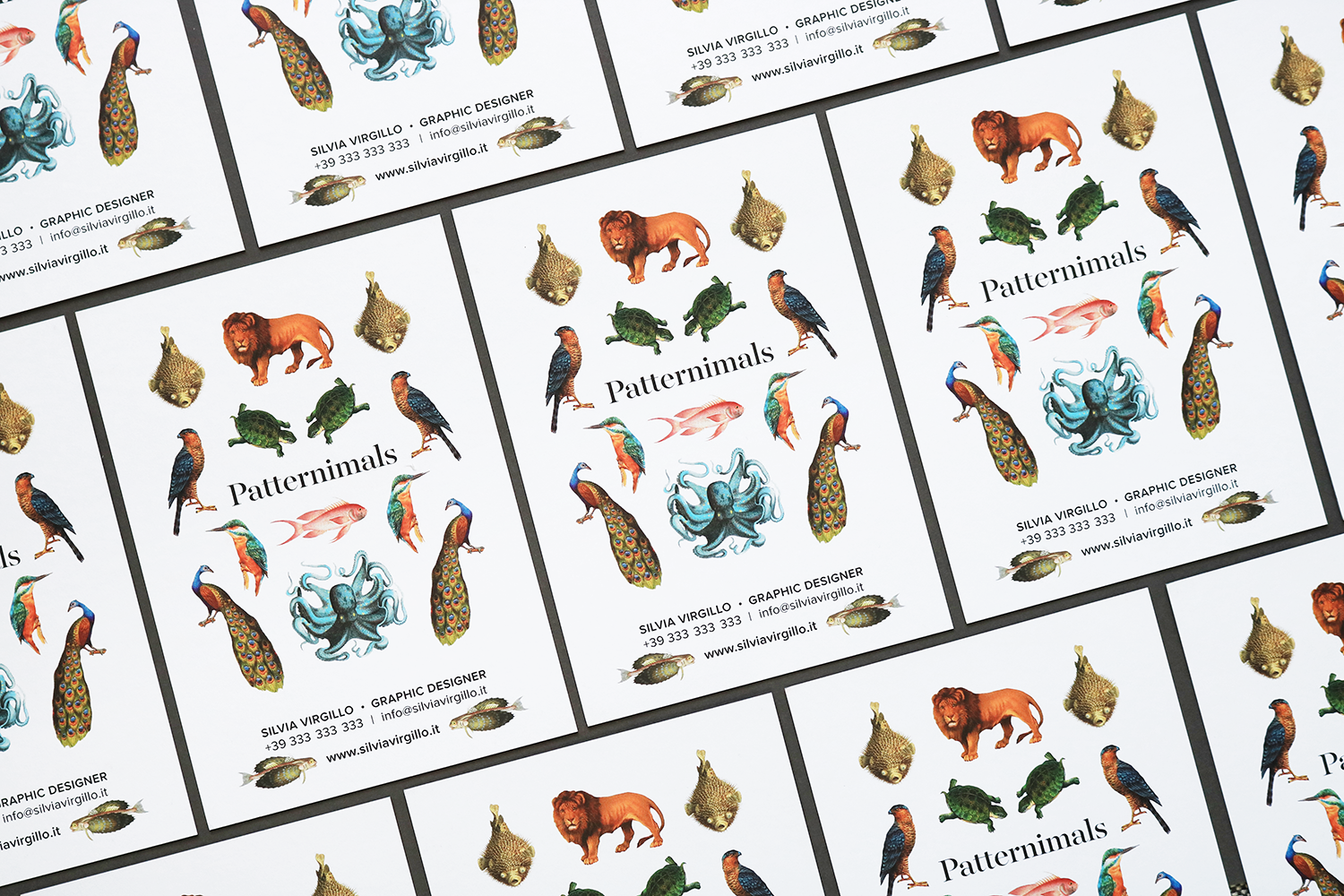
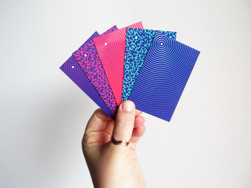
Patternimals’ cards
/ pattern design /
Single illustrations, taken from old-time archives, become patterns.


